Auto Layout 3.0 in Figma
Share:
Back at Config Europe 2020, the Figma team announced a new update to Auto Layout, which is set to be released in the next two weeks. As with all Figma updates, when the changes are live, it’s immediately available to everyone, both in-browser and in their desktop apps.
Figma added Auto Layout back in 2019, introducing intelligent layout rules. Before that, designers laid out elements on a free canvas with no intelligent restrictions. Sure, there were layout guides or grids that could be turned on. But really it was up to you, the designer, to make sure everything lined up.
With Auto Layout, designers could make updates to things like button text without manually adjusting the size of the button frame, or add blocks to a row or column, and it would all resize by itself, like magic.
This was a game changer. On its release, Guilhem Gantois, a UX Consultant at Microsoft, wrote that:
Auto Layout is an absolute pain-remover. It solves so many issues and allows me to make way more generic components with basic controls, instead of new components for variations in content.
Auto Layout empowers designers to create layouts that adapt to different frame sizes, allowing for a greater understanding of how designs will respond across devices.
Responsive design and having a mobile-first approach are concepts that have been heralded for years, but until now it’s primarily been a responsibility for developers. Designers have just had to create layouts on a canvas, making multiple versions to try and cover the most popular devices, and then let developers interpret and implement those layouts.
That all changes with Auto Layout 3.0, and a coming-together of design and code. Let’s look at what’s new.
A new, simpler UI
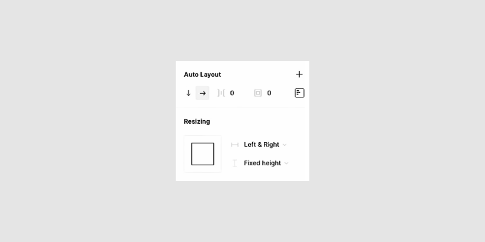
Auto Layout is confusing for sure, especially if you’ve come from creating screens in Photoshop and Sketch. It’s lots of numbers and symbols and fiddly alignment options.
The new UI aims to make it a lot simpler. With the new features coming, it’s a good time to roll this out.
The options are, in order:
- Direction
- Margins
- Padding (configurable in individual direction, and either packed or space between)
- Resizing options (in both directions: fixed width, hug contents or fill container)
If you’ve used the no-code website builder Webflow, this will no doubt seem familiar to you. It’s a visual way of understanding the Flexbox layout model and makes it far easier to look at and intuitively grok.
An aside: Flexbox isn’t the only layout model there is. It’s one of a few ways of laying out content in CSS. Many web developers are preferring to use something newer called CSS Grid, although it has less browser support. These both make use of the CSS box-model, where all elements have a content edge, padding edge, border edge, and margin edge.
(There’s also something called Auto Layout for iOS apps, which dynamically arranges Views hierarchically. But this is totally unrelated to Figma’s Auto Layout, which is based on Flexbox and the CSS box-model.)
Independent padding values
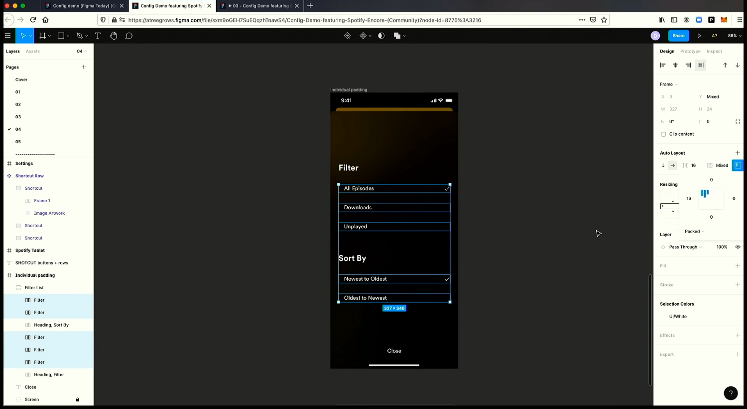
Elements that are in a frame with Auto Layout can now have individual padding values applied on all sides!
This is amazing! Previously, this was only hackable using ‘spacer elements,’ which muddied up your layout with unnecessary shapes. And it even then, using spacers would only allow you to introduce padding in one direction, without nesting frames.
In the example above, you can see how a frame with two subheadings and five rows is edited to have indents and space-above, meaning that it’s much easier to introduce whitespace to your designs and allow them to breathe, while benefiting from Auto Layout, without cluttering your file.
Stretch on both axes
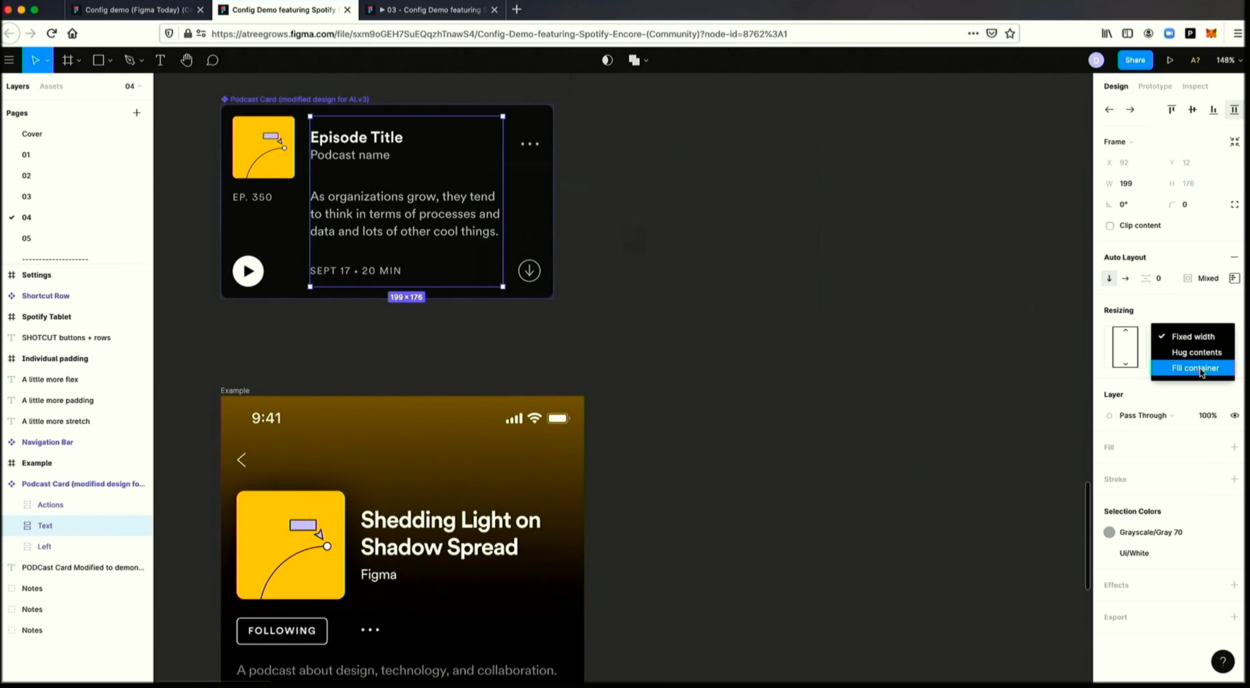
Previously, a frame with Auto Layout applied could only stretch in one direction. You can now set those frames to autofill a container.
Let’s look at the above example. The text section of the podcast card previously could only be set to auto-width or fixed-width, OR auto-height / fixed-height, depending on whether the frame had horizontal or vertical Auto Layout.
Now, you can set a frame with Auto Layout to fill its parent container, even if the frame is a vertical stack and the parent container is scaled horizontally. It just works.
If this all sounds confusing to you, don’t worry. You’ll never have to worry about how the old Auto Layout worked!
In summary…
Auto Layout 3.0 still isn’t perfect. It won’t make developer handoff blissfully easy. It’s not a perfect analogy to code.
But it empowers designers to understand the destination their designs are heading for. It makes iterating within constraints faster. And, hopefully, it eases the conversations between designers and developers.
It’ll be out by the end of November, and I’m excited to give it a spin.