Designing complex desktop interfaces
Share:
This article is a version of a talk I gave at the AND Digital UX Community of Practice in February 2022.
In this article, I’m going to explore the process of designing complex desktop interfaces. The first half looks at defining what a complex desktop interface is, and the second half explores design principles and tactics that can be of help.
In search of a definition
We know what an interface refers to. An interface is a thing that a user can interact with, in order to accomplish some task. Typically, when we speak about interaction design, we mean digital interaction design: interactions that happen on your favourite glowing rectangle, such as a smartphone screen or a laptop screen. However, interface design comes from a tradition of designing physical things: flight controls, TV remotes, a Hermann Miller chair, an iPod click wheel.
So what specifically is desktop interface design? Let’s start with this definition:
A desktop interface is a screen with dimensions 1280 by 720.
But what about 1440 by 1024? Or 1728 by 1117? Or anything with a DPI of 96 or higher?
Quickly we see that a definition based on point dimensions or display resolutions breaks down. In the last 30 years, we’ve seen enormous changes in display resolutions and colour replication, and the physical changes will only continue to improve.
Monitors have changed drastically over the last 20 years and will continue to do so — therefore there’s no set of screen sizes or resolutions that can correctly be labelled ‘desktop interfaces.’ It doesn’t make sense to tie a definition to hardware.
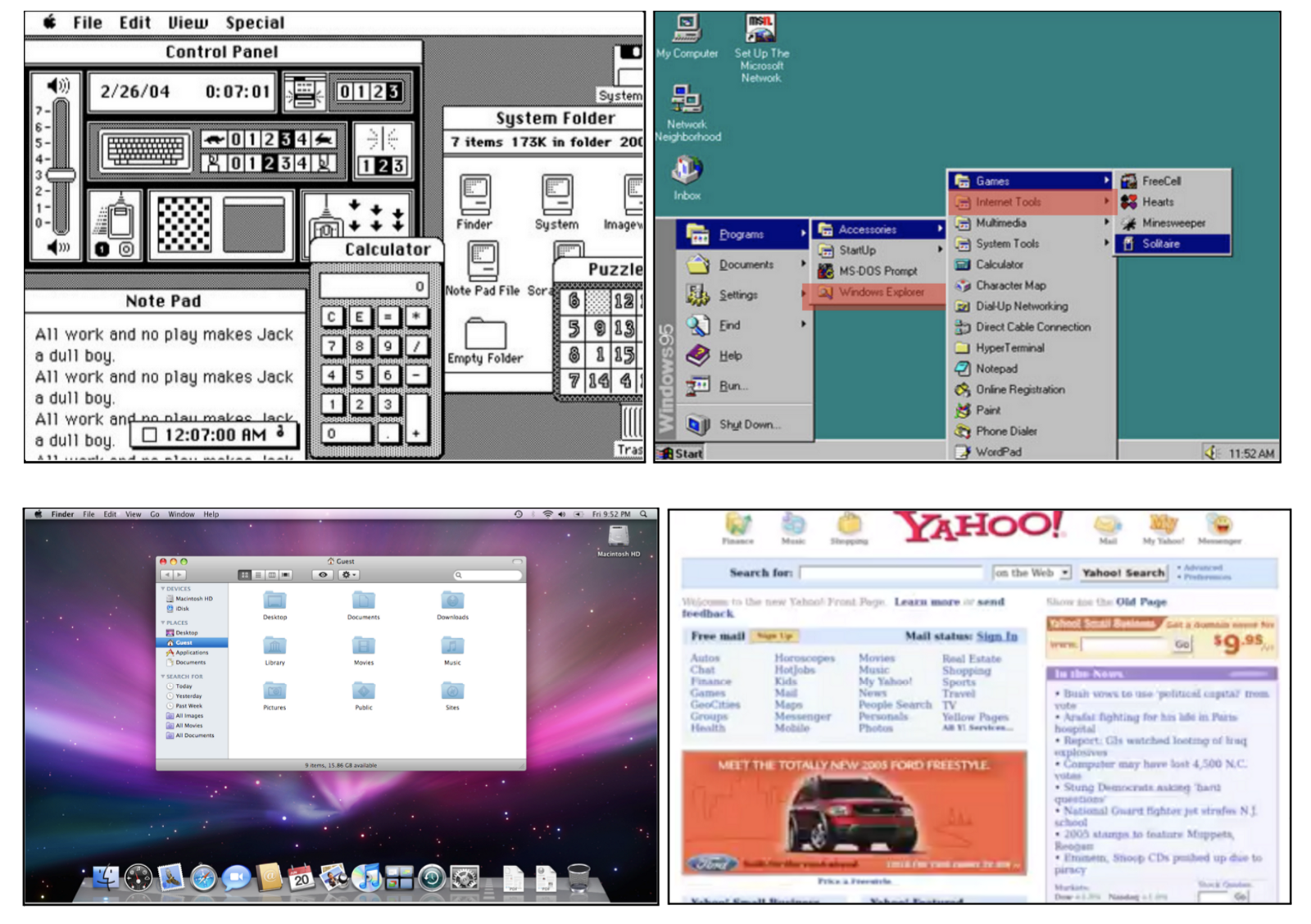
Clockwise: the 1984 Macintosh, Windows 95, the Yahoo homepage in 2004, and MacOS 5 years ago, when it was still called OS X.
So instead of tying a definition to hardware. how about we try a functional definition:
A desktop interface is any interface used on a traditional computer or workstation, i.e., used on a laptop or desktop computer, compared to those on a mobile phone or tablet.
Even though phones and tablets are getting bigger, we can still intuitively differentiate between a phone or tablet interface compared to a laptop or desktop interface.
The problem with this definition comes when considering apps like these:
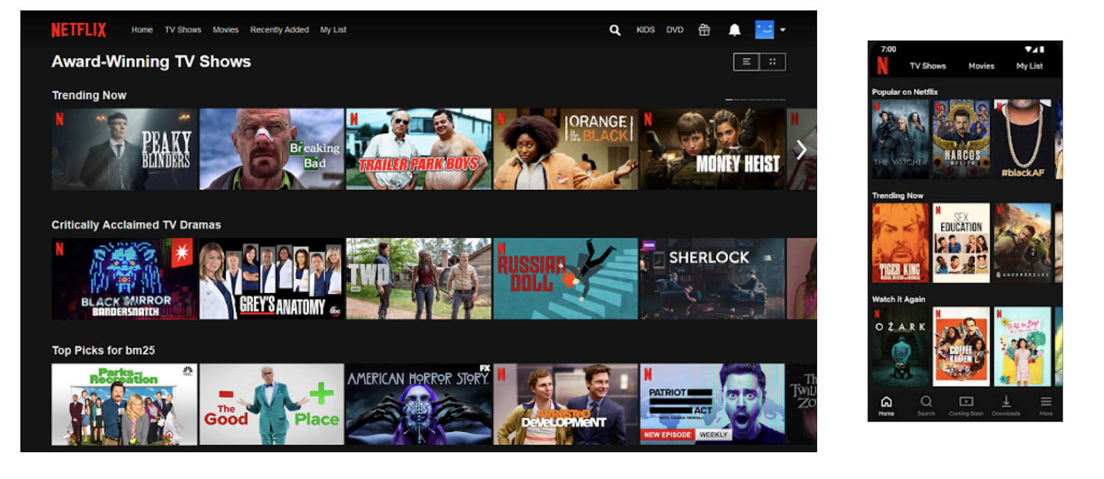
This is the Windows 10 native app for Netflix, side-by-side with the mobile Netflix app. You can see instantly how similar they both look. I wouldn’t be surprised if they shared a codebase, meaning one is literally a scaled-up version of the other.
So the problem with a functional definition is that it doesn’t really kind of capture the complexity of what I’m trying to describe. Lots of desktop interfaces feel like scaled-up mobile interfaces.
Let me pause here to say — this isn’t a bad thing. That Windows 10 Netflix app looks incredibly intuitive to use and navigate, even if you’ve never seen it before. And it passes one ultimate test: I think my parents would be able to use it, without my help.
But it’s not an example of an interface which is complex or specialised or advanced. It’s designed to get you quickly to your goal: to watch a show or a film. It’s not designed to be interacted with for any length of time. It doesn’t make use of features specific to working on a desktop or laptop computer, such as a high-resolution display and a pointer-based input. And it doesn’t have any UI designed for power users, or to help you accomplish advanced tasks.
Arguably, a lot of desktop software is heading this way. In an article published last year, Riccardo Mori writes that: “in recent years [there has been] a progressive iOS-ification of Mac OS.” But power users hate this. Writing about some minor design tweaks to the Shopify dashboard, in which icons were refined and whitespace was tightened up, interaction designer Jeff Chausse tweeted that:
“people who “live” in some key apps really don’t appreciate white space as much as designers want to think they do. They want information density. Whitespace is much less important when you’re intimately familiar with an app.”
I think this captures what I’m getting at. A complex desktop is one used by people who live and breathe in that software.
Before we approach our final definition, let’s look at some examples of complex desktop software:
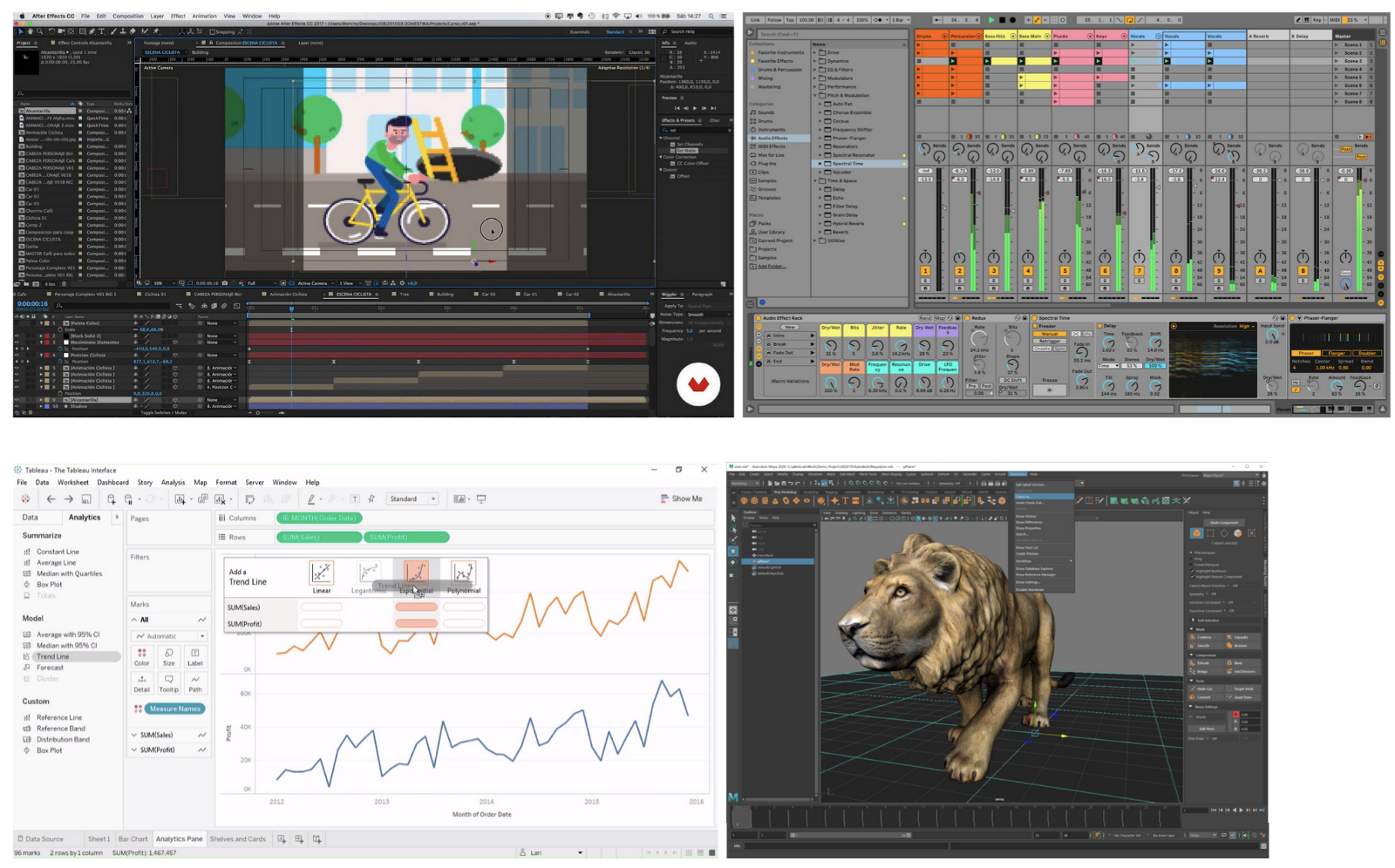
The information dense interfaces of complex software. Clockwise: motion graphics and animation software Adobe After Effects, music production software Ableton Live, 3D design software Autodesk Maya and business intelligence software Tableau.
In all of these examples you can see similar design patterns: small point sizes for interface labels, dense arrays of menus and options, detachable and toggle-able panels and contextually appearing information.
And, to look at a parallel to a real-life interface, I’m reminded of this:
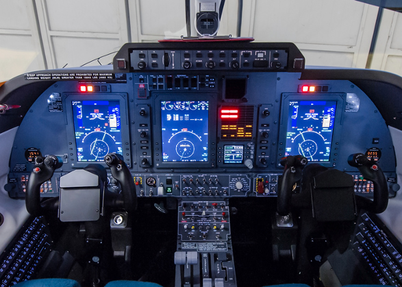
A flight console is incredibly complicated. There are so many controls and toggles and displays of information accessible at any one time. But a pilot requires access to all of these things at once, and is intimately familiar with it and able to use it effectively.
This brings us to our definition:
A desktop interface is an information-dense interface designed to be used primarily by specialist users on a desktop or laptop computer with a mouse pointer.
We can dissect this into these four points:
A desktop interface is:
- an information-dense interface
- designed to be used primarily by specialist users
- on a desktop or laptop computer
- with a mouse pointer
Principles and tactics
Recently I’ve been designing interfaces for a biotechnology company that AND Digital is partnering with. The software tools I’m working on are similar to the examples I listed above: highly technical and designed to be used by specialist users. For this project, I researched what design principles exist for complex desktop interfaces.
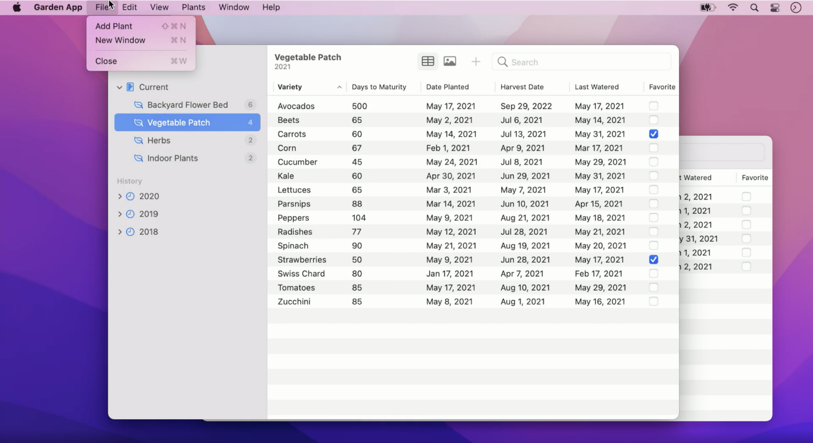
One source of principles came from Apple. Mathieu Tozier hosted a code-along session at WWDC21, where he walked through how to create a native Mac app that shows information about a garden: which plants you have growing in which spaces, how long they’ll take to mature, when they were last watered, and so on.
This application also demonstrates four design principles, which Tozier argues are fundamental to keep in mind when designing any native Mac app. I think these principles apply to all complex desktop apps, not just ones for Macs.
They are as follows:
Flexibility
The interface should be flexible, adjusting to how each individual uses it. A user should be able to adjust columns, sidebars, detail panels, display modes and windows, in order to work in a way that suits them best. This also applies to physical interactions — one should be able to flexibly use a keyboard, mouse, trackpad, switch control, or even an iPad to control and input information.
Familiarity
The interface should be familiar to any user. A common visual language of controls and design patterns make the app immediately approachable. In the example above, you can see that the File menu and search bar are positioned in a consistent way compared to other Mac apps. Navigation and hierarchy lie in the sidebar, content lies in the centre, and user functions can be found along the top and right-hand side.
This idea of familiarity isn’t exclusive to Mac apps. Consider Adobe’s Creative Cloud suite of apps. Regardless of OS, all the CC apps have familiar patterns of menus and navigation, making them approachable.
Expansive
The interface should make use of and be expected to work on a single or multiple displays. Lots of information can be organised and shown on screen without being hidden away in navigation stacks or collapsed menus.
In Mac apps, this specifically means using controls like: sidebars with outline views and thumbnail previews; popovers for transient elements; tabs to toggle between panes of controls; and disclosure groups to display content.
But again, this notion of expansiveness isn’t limited to Mac apps. In the cross-platform 3D design software Autodesk Maya, a user can control different shelves of tools, and tear off panels such as render views or camera perspectives, moving them to other displays.
Precise
The interface should allow for large windows with multiple views, each with tight margins and spacing, to allow for high densities of content and controls. Moreover, these controls should be designed to be used with a mouse pointer.
Hopefully you can see how these principles apply to the above gardening app, and to any of your favourite complex software tools.
Another source I found was this list of eight design guidelines for complex applications, from the Nielsen Norman Group. I think these are best thought of as tactics rather than principles. I want to highlight four here, but I recommend checking out the full article.
The tactics are as follows:
Promote learning by doing
An example of this would be an editing panel side-by-side with a live preview panel. Instead of having to work through a manual or set of instructions, a user is encouraged to work things out on the fly.
Give contextual help
An example of this would be a tooltip that offers contextual information when hovering on a control. A user would be able to see quickly what that part of the interface does, allowing them to learn or remember it on the fly, instead of navigating somewhere else.
Provide flexible pathways to reach a goal
An example of this would be allowing a user to jump to any stage of a multi-stage form. Instead of having to fill out information linearly, they can jump around, having the flexibility to edit different stages instead of having to follow a specific order.
Reduce clutter (without removing complexity) using progressive disclosure
Progressive disclosure means having different options appear or vanish, depending on the context. You see this on gov.uk forms — certain fields appear based on earlier information that’s been selected. It also has a place in complex interfaces. An example comes from Autodesk Maya, where a drop down in the top left of the interface allows you to dynamically change what menu bar options are available.
In summary
To sum up:
A complex desktop interface can be defined as one with:
- an information-dense interface
- designed to be used primarily by specialist users
- on a desktop or laptop computer
- with a mouse pointer
Four design principles for complex interfaces are:
- Flexible
- Familiar
- Expansive
- Precise
Four design tactics:
- Promote learning by doing
- Give contextual information
- Provide flexible pathways
- Reduce clutter with progressive disclosure
It’s good to be detailed and it’s good to sweat the small stuff. To end with a quote from my favourite magician, Nate Staniforth:
The details are important. Otherwise, the barbarians overrun the city gates and every good thing gets trampled under the plodding, uncaring tread of mediocrity, and we have to keep them at bay.
Thanks for reading!
If you think I’ve missed anything, let me know on Bluesky here or drop a comment below. I’m still learning and growing as a designer and always wanting to improve any way possible!