Get started with Variants in Figma
Share:
Figma released an update last week to bring the Variants feature to everyone. Variants were first announced back in September, at Config Europe 2020. They’re now available to everyone using Figma in-browser or on the Desktop app.
Let’s take a look at how they work.
What are Variants
Variants are a way of grouping similar components together. You do this by selecting the components and combining them into something called a component set. Each component then becomes a variant in that component set.
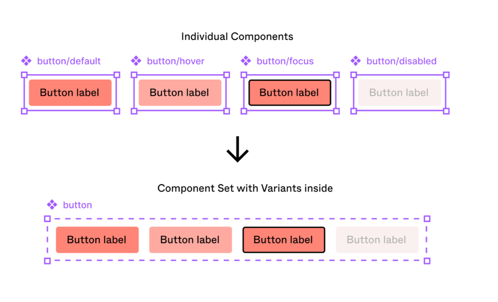
Grouping similar components as variants in a component set is unbelievably useful when you’re using those components in your designs. Moreover, the benefits are compounded when you are designing complex screens across a range of devices.
When to use Variants
Variants are great to use if you’ve ever made multiple versions of the same component.
As you can see above, creating buttons are a great example of this. Often a design system needs multiple types and combinations of buttons: large buttons, small buttons, buttons with icons, buttons in a hover state, buttons in an inactive state, and so on. Previously, it was incredibly difficult to swap between instances of a button, and it could only be done at the lowest grouping level.
So, if your design system was set up so that a button is created like so:
> Button / Primary / Large / With Icon / Hover
Then you’d only be able to swap between that last grouping, e.g. between default/hover/inactive/pressed.
Using variants instead makes swapping way quicker and easier. All the variants are available in the sidebar for you to access quickly.

Why are they called Variants
All of this may sound like a really good way to handle component states. You’re probably therefore wondering, like I was, why the name ‘variants’ was used. Wayne Ng, from the Figma team, shed some light on this on Twitter, by sharing a clip of a usability test that Figma conducted with the team at Fidelity, who was testing an early beta of Variants.
From that clip:
[Calling it] ‘states’ waters down the power of it… It makes you think, just, states of a button, or states of an object, as opposed to ‘super customizable component that you can do whatever you want with… feature’
What we still can’t do… yet
Prototyping between variants doesn’t work exactly as you might expect just yet. You can’t hover on a button in its default state and have it seamlessly swap to a hover state, without wiring up lots of duplicate screens. This makes prototyping multiple states simply not feasible for most moderately complex designs.
This might be something that’s coming soon though. Back in September, at Config Europe 2020, the Figma team showed off a new feature for prototyping simple component interactions, which means you won’t have to wire up every iteration of a component state when prototyping. You can watch the video here. It’s coming in January 2021 and is something I’m really looking forward to.
It’s also worth pointing out that you do still need to create every permutation of a component in your design system. So the creative process isn’t sped up. But by using variants, you’ll speed up when actually using components, and you’ll benefit in both efficiency and organisation.
Developer-friendly
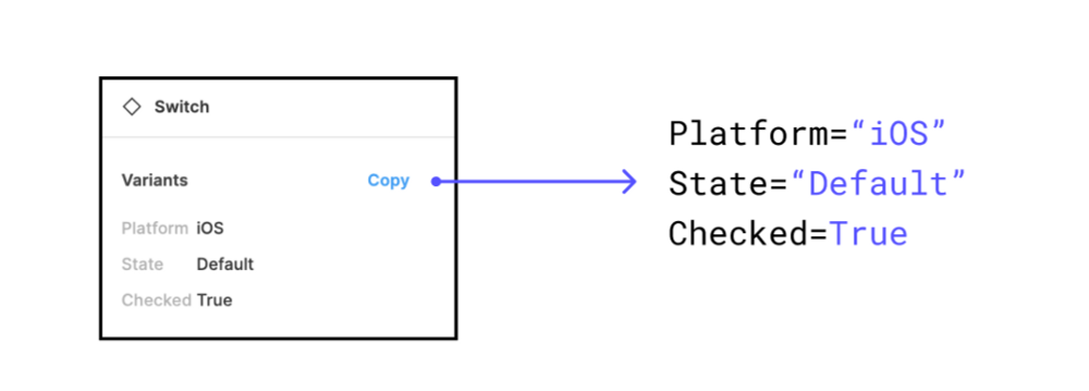
Variants also bring your design closer to code.
The updated Inspect panel allows the developers who will eventually implement your designs to copy a set of properties in one click.
This means that, if you align with your developers about what terminology they use, you’ll be able to save them a lot of time when setting up Variants.
How to get started
The best way to get started is just to try it out!
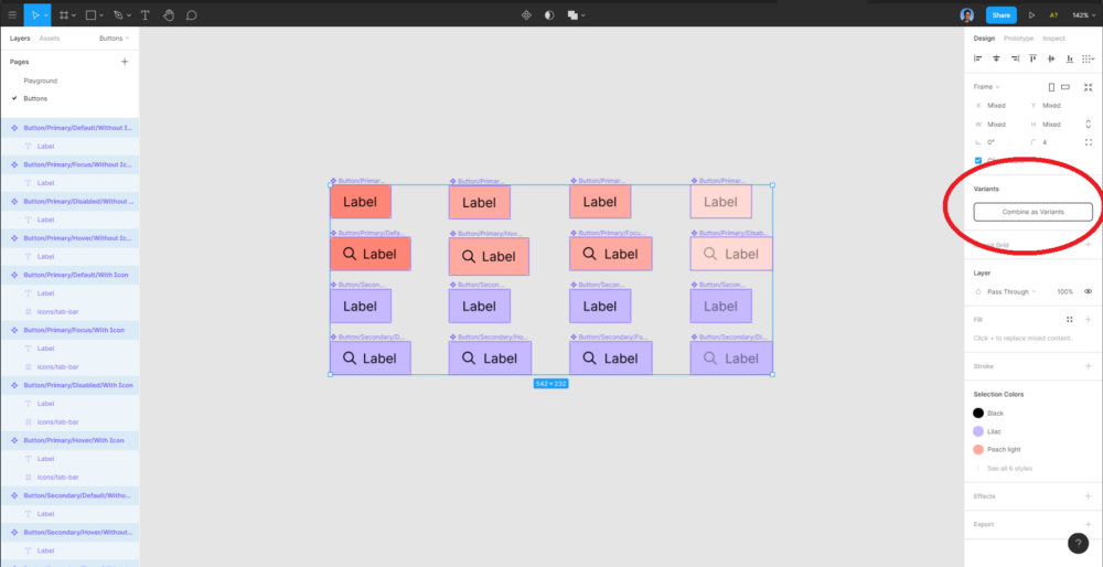
You can see the new Combine as Variants option on the right hand sidebar.
If you have a Figma file with a design system, or even just one with a few similar components, give Variants a spin. Select a group of components and hit that magical Combine as Variants button in the sidebar. So long as they are labelled with properties separated by a ‘/’ divider, it’ll work automagically.
(I would probably duplicate the file first, though, just in case you need to go back.)
Play around with options for naming properties and check out the new way of swapping between instances. You’ll soon see how valuable and time-saving it is.
I also highly recommend checking out the official Figma introduction file. It takes about ten minutes to go through. You’ll learn about a lot of hidden things which you might not spot, such as making properties into toggles by using boolean values, and reordering properties.