Low-fi app screens to study/relax to
Share:
If you’re building an app, you’ve got to start out low-fidelity. And no, I don’t mean low-fi hip hop beats. I mean low-fidelity app screens.
What is low-fidelity?
Let’s clear up some terminology. Low-fidelity, in app design, can refer to either to low-fidelity screens or low-fidelity prototyping.
Screens are static and simply show what your app looks like. You need a screen for each state of your app. So, for example, for the Sound Off app, we have created screens for when you first open the app, for when you are recording, for when you finish recording, for playing back, and so on.
A prototype is simply a way of connecting those screens up so they are interactive. This means you can get a better idea of the overall app flow and different user journies through the app.
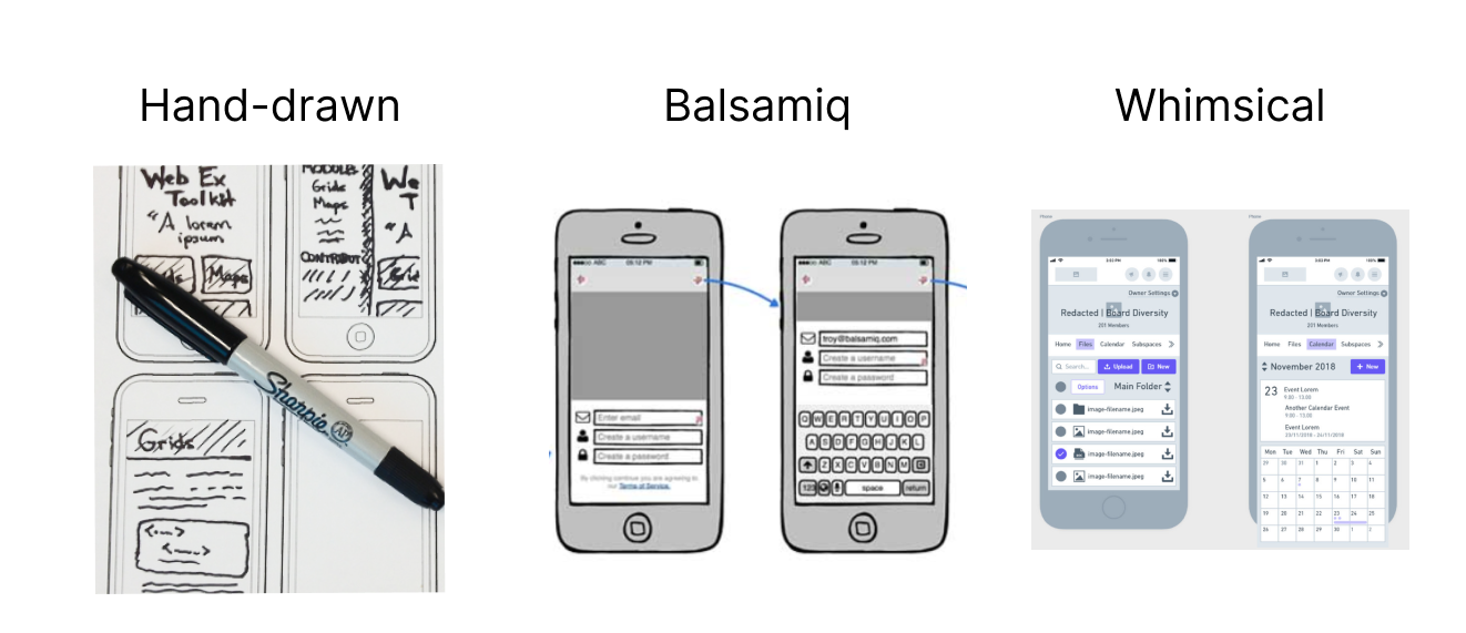
Low-fidelity means that everything is designed without colour, images, fonts and so on. This may not sound important, or even like anything is being ‘designed,’ but it’s essential to ensure everything is laid out correctly and in a way that makes sense.
Low-fi screens can be done by hand. Often a thick marker, like a Sharpie, is used so that you don’t obsess over the details. Or they can be made using design software. Whimsical and Balsamiq are two great online tools that force you to stay low-fi, so you can really nail layout and flow before worrying about the details.

In contrast to low-fidelity, high-fidelity screens and prototypes do have final designs, colours, logos, images and fonts. A high-fidelity prototype should be as close to your final app as possible.
Of course, it will only be identical in looks – none of the actual app functionality is built into a prototype, beyond basic interactions and transitions – but it’s vital to understand what you’re building before spending lots of money one development.
The set of high-fidelity screens or prototypes is what gets passed to a developer (called developer handoff), who uses them to build out the app.
Why bother with low-fi?
You might be thinking: what’s the point in starting with low-fidelity screens and prototypes? Why should I waste time with it, when I can just jump straight into high-fidelity?
This is why: by starting out low-fi, you (or your UX designers) can get started on blocking out the app and testing the flow, without first needing final decisions or full clarity on what your brand is, what the total functionality is, or even what the app is called.
It’s a way to get going with as little risk as possible.
If you were to start out in high-fidelity, there’s the risk of needing to make huge changes as you increase your understanding of your problem.
A simple example: the Sound Off app has a dark theme, as we know from research, testing and pilot trials that users primarily want to sound off at the start or end of their days. We didn’t know this when we started building our app screens in low-fi. So, if we’d rushed into making beautiful, polished high-fi screens, we might have had to scrap our entire colour palette and app theme and start from scratch.
(I hope Rory doesn’t mind me giving this away! If you want to get an early peek of our app, follow our private Instagram a follow.)
Speed is everything
Speed is everything for a startup founder.
When we were working on the low-fidelity screens for Sound Off, we were at the same time reviewing our business plans (or at least an understanding of our cost/revenue structure); trying to nail our customer segmentation; comparing development partners and reviewing our scope of work and their contracts; finalising our brand and all related assets; and, loosely thinking about our go-to-market strategy.
By working in low-fi, we could move fast, break things, and change things quickly. This allowed us to quickly learn more about the problem we were trying to solve. And, the more we learnt about our problem, the better our understanding of our target users became, which in turn led to us making new decisions (and changes) to the app flow and the functionality we needed to prioritise.
Last week, I wrote about the benefits of starting with a make-believe product. Moving quickly using low-fi prototypes also allowed us to test a prototype of our product with real people.
Getting a version of our product in front of actual people wouldn’t have been possible if we waited till we had beautiful, polished high-fidelity screens. And in those usability tests, we gained invaluable knowledge about our app’s layout and navigation (and fixed lots of problems we wouldn’t have spotted before it was too late.)
So, as well as reducing risk, working in low-fi means you can work at speed, rapidly iterating and gaining new knowledge.