More great personal websites
Share:

I hugely enjoy looking at personal / portfolio websites — they’re a great source of inspiration for exciting and creative websites. Whenever I find one I really like, I bookmark it to come back to.
Going into next year, I know many people may be looking for new work. If you’re about to update your portfolio or write new case studies, take a look at these sites for inspiration.
These 11 sites are presented in no particular order. They’re all portfolios of UX / product design portfolios, apart from a couple of developer websites and blogs. All have amazing standard of design and great readability.
If you missed my last round up, check it out here.
- Angela Li (liangela.com)
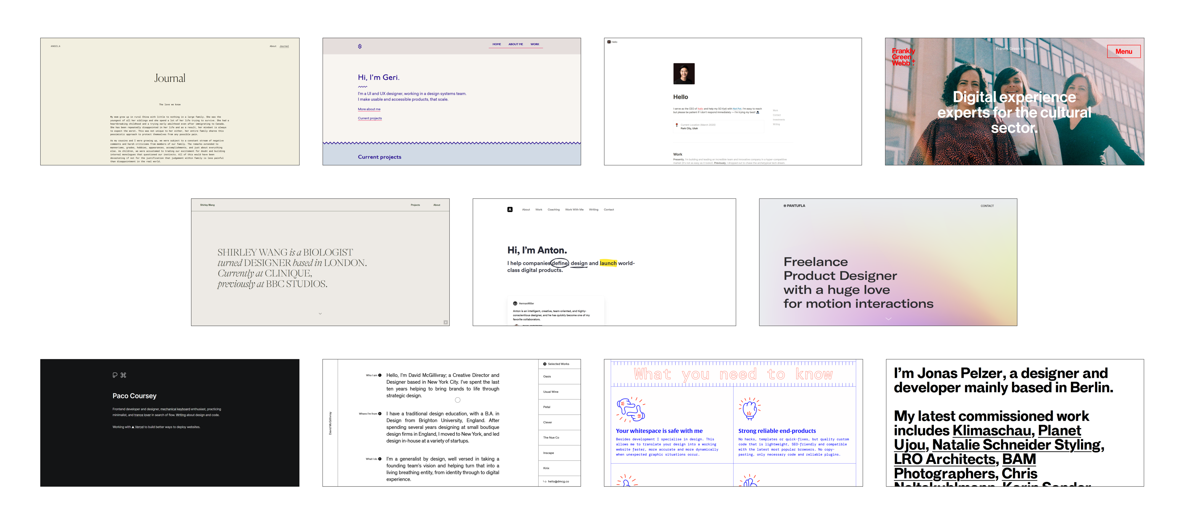
Angela is a product designer at Dropbox. Her site is wonderfully minimal. I particularly love the Journal section — both because she writes beautifully and because of how elegantly its laid out. - Geri Reid (gerireid.com)
I found Geri’s site via Design Club, an initiative that teaches design thinking at London schools. Her one-page site (which she coded from scratch) is so full of joy. I love the colours, the squiggles dividing sections, and the clear breakdown of her work. - Jeremy Cai (jeremycai.com)
Jeremy is the CEO of Italic. I wanted to include Jeremy’s site as it’s one built entirely on Notion — proof that you don’t need coding knowledge or even a website building tool to make a sleek website.
It’s effectively a one-pager, with sections for his CV, investments and blog. I also really love the drop-down responses in the contact section — it’s really neat, and I imagine it cuts down on the cold requests he receives. - Frankly, Green + Webb (franklygreenwebb.com)
Okay — I know I’m cheating here, having an agency site instead of a personal one. But this agency feels so personal! The focus is on the three individuals who run the show, and their site is big, bold, and impressive. I particularly love their logo wall. In their own words “10 years, big names.” - Shirley Wang (shirleywangdesign.com)
Shirley’s site is built with Cargo, and it’s damn beautiful. The hover previews of the work she’s done are really clever, and, despite being mostly type-driven, it still retains a personal flair (“Shirley is a biologist turned designer…”). - Anton Sten (antonsten.com)
Anton’s site is clean and minimal, but I included it here for the gorgeous animation that happens when it first loads. It’s nothing crazy: the word ‘define’ is circled, ‘design’ is underlined and ‘launch’ is highlighted. But here, it serves to really sell you on the idea that Anton is a professional who knows what he’s doing.
Animation and moments of delight are so often considered as an afterthought, and something solely for ‘fun’ websites, but Anton shows how to use a little bit of animation in a skillful way. - Pantufla Cuántica (pantufla.co)
Pantufla’s site is colourful and puts emphasis solely on her work. There’s no fluff; the site is just gorgeous full-screen screenshots, and contact details. - Paco Coursey (paco.sh)
At first glance, there’s not a lot to Paco’s site. I liked that some of the site’s pages were disguised in the introductory prose. But then, you click on the command icon (or press Cmd+ K) and a secret launcher reveals itself. - David McGillivray (dmcg.co)
David’s site was made with Webflow. Like Shirley’s site, he also has a great way of revealing his project work with hover effects. His case studies are clear and well-presented, and there’s a lot of delightful flair: the way the 9 questions stay fixed then stack on each other when scrolling; the footer that fades in; the ‘click to copy’ prompt for his email address. - Ruben Meines (rubenmeines.com)
Ruben’s website is colourful and direct. His cartoon hands and the blue/red combo make the site friendly and add a unique flair. He also lets his work as a designer/developer speak for itself, with links to live websites instead of lengthy case studies. - Jonas Pelzer (jonaspelzer.com)
Jonas’s website is loud, simple, and to-the-point.