Redesigning the NHS Blood Donation app
Share:
In this article I briefly describe my process of redesigning the NHS Blood Donation app based on a set of usability tests.
This was a short project to practice the process of auditing the user experience of an existing app. I therefore didn’t end up redesigning the whole app, but just made a start on it to see the new direction it would go in.
I cover why I chose this app, the research and design processes, and the lessons I learnt. Thanks for reading!
Contents
- A note on unsolicited redesigns; why I chose this app
- Usability tests
- Collecting results of usability tests
- Other ‘UX Deliverables’
- UX conclusions ➜ UI decisions
- New protoype and more usability tests
- Future additions & lessons learnt
1. A note on unsolicited redesigns, and why I chose to redesign this app
Generally, I’m not a fan of unsolicited redesigns. They are often done mindlessly, without considering the purpose of the redesign. (This article covers some of the problems with unsolicited redesigns.)
But in this case, I am, on purpose, choosing not to look at the visual design elements of this app. I think the user experience parts of the app are much more interesting to examine. The conclusions that result from this UX research can then guide the redesign.
Moreover, I think that (in this specific app that I’ve chosen) the individual design elements are good. The app is part of the NHS, which has some great design and branding guidelines, and the blood donation service itself has a really good logo. What does need work is the usability of the app.
So let’s test the usability and see what we can fix!
2. Usability tests
There are lots of ways of researching how users use a product. Usability tests fit into the following category:
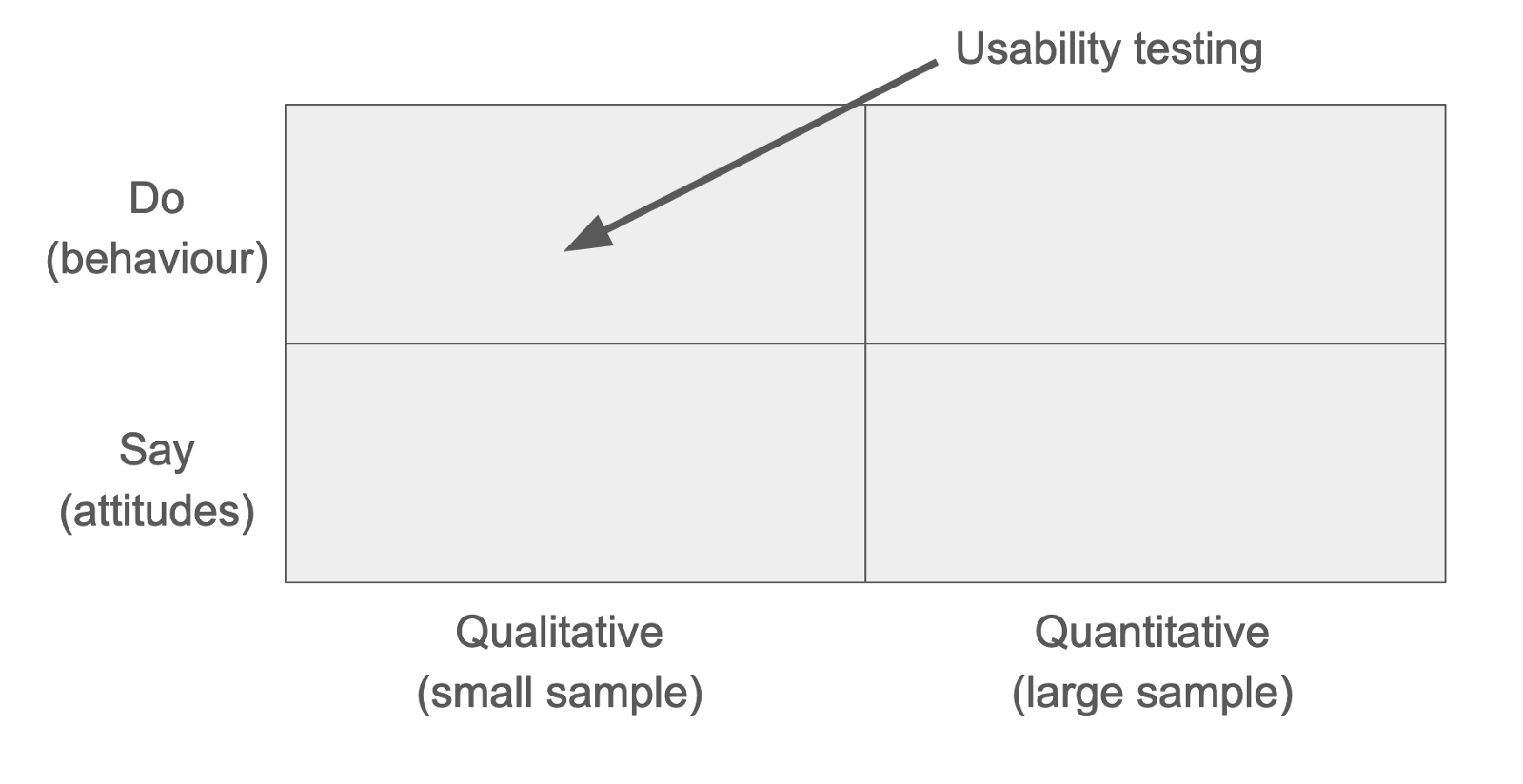
Instead of focus groups or surveys, which look at what a user reports about their use of a product, a usability test observes the user’s behaviour.
It doesn’t always make sense to do a usability test (e.g. if you are creating a new product from scratch.) But if you’re working on improving an existing product, then arguably it’s the most important of user testing that you can do.
How to do a usability test
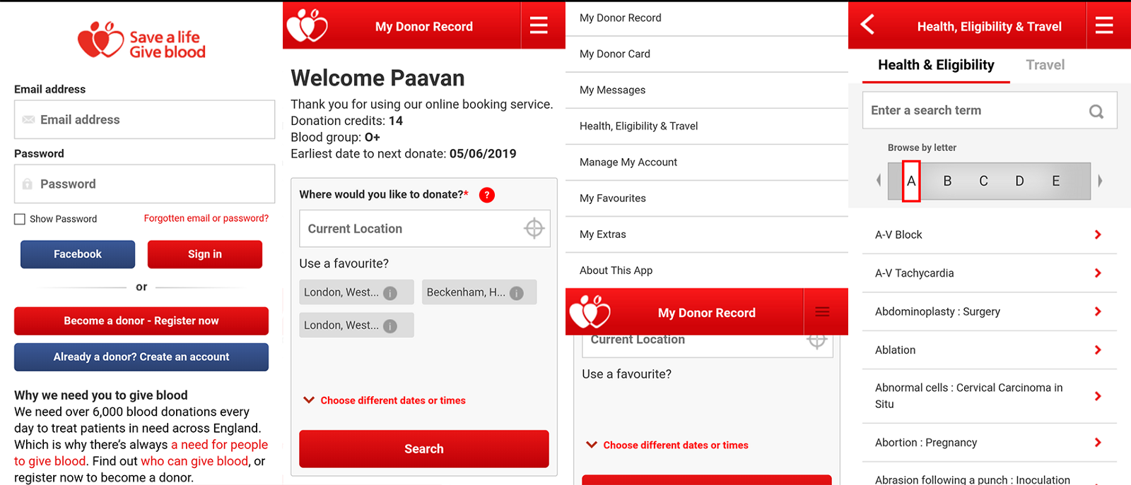
I booked out a small room, set up a video camera on a tripod, and invited in participants to do a test one by one. (In my case, these were some friends that I’d roped in — thanks gang!) They were each given a phone with the app already installed and logged in, and were asked to complete four tasks as part of the test.
‘Test’ is a misnomer. There’s nothing that your participants can do that is the ‘right’ or ‘wrong’ thing. You just want to watch what they would naturally do.
You’ll want to standardise your script, so everyone is given the same introduction, background and the same tasks to complete.
Unmoderated tests will probably max out at about 15 minutes, whereas moderated tests (like the ones I did) could last for up to an hour.
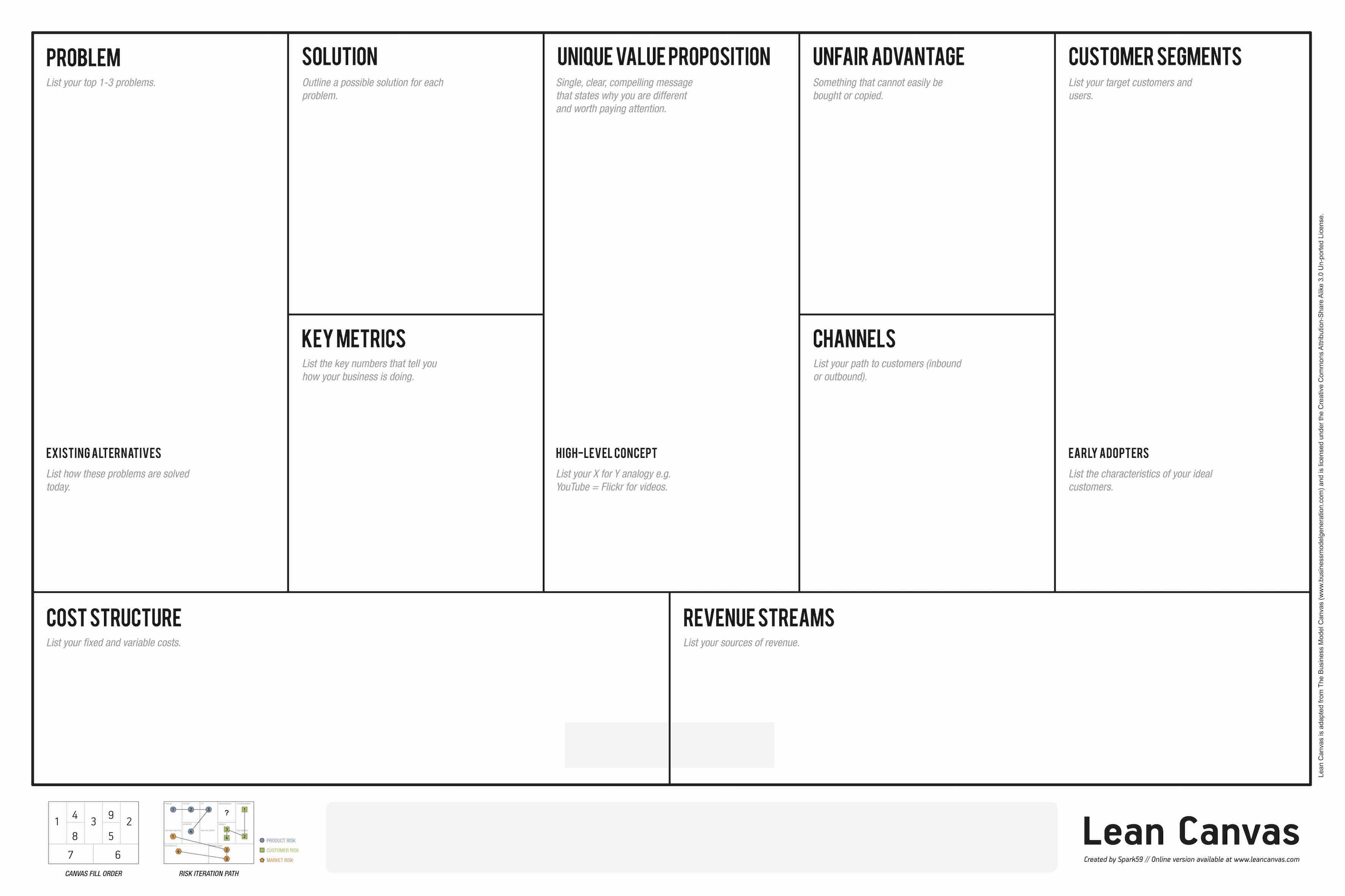
To decide what tasks you give your participants, you need to work out: what problems people are using your product to solve, who your users are, who your competitors are and what they’re doing differently, what the unique value proposition of your product is, and so on. Take a look at the Lean Canvas if you’ve never seen it. It’s a great, quick way to answer all of these questions.
(In my case, I only had a four tasks, and none of them covered the new user or login flow. This was because I wanted to keep the scope of this project quite small. In a real project, you would provide enough tasks to cover the entire user flow through the app, including signing up. You’d probably also pay your testers for their time, either in vouchers or cold hard cash. Sorry gang!)
The tasks I gave my testers to complete were:
- Book an appointment to give blood at a time and place convenient to you.
- Find out what blood type you are.
- Determine if you are eligible to give blood, given that you had a tattoo 8weeks ago.
- Determine if you are eligible to give blood, given that you got back from Kuala Lumpur in Malaysia last month.
When your participants perform the tasks, it’s important not to interrupt or break their process. It can be frustrating watching someone repeatedly tap the same button when there’s an ‘obvious’ right way to do something, but that’s the whole point. The participant isn’t doing it wrongly — instead, your product is not designed optimally.
You want the participant to narrate what they’re doing and what they’re thinking. But don’t use leading questions or say anything that could give them a hint about what to do. Instead, use open questions (e.g. “tell me about what you’re seeing”) so that you get an unbiased view.
To decide how many people to run usability tests with, first consider how many user types you can have. Often this segmentation of user types is encapsulated in fictional personas, e.g. Good Guy Greg or Cash-Strapped Casey. (If you have Skillshare, this short course about personas is a great run-down.) As a general rule, you want to try and run 3–5 usability tests for each persona type, and around 10 in total. But running usability tests and analysing the results takes a lot of time, so this will definitely vary depending on budget.
3. Collecting results of usability tests
Now that you’ve set up your usability tests — what are you actually looking out for? We can break this up into quantitative results and qualitative results.
Quantitative results
For each task, you should quantify the participant’s success.
One way is to rank success in three levels: (1) the participant was unsuccessful, (2) the participant was successful but with lots of help from you, and (3) the participant was successful by themselves. For the tasks that are unsuccessful or where the participant needed help, you should note down why that was.
Another way is to measure the time taken to complete each task.
Qualitative results
After each task you should ask the participant questions: did anything about that strike you as particularly good or bad? Did you feel something could have been explained better?
You can also collect initial impressions of the product: what do you think the purpose of this app is? Where would you click first if you saw this screen?
And ask ‘exit interview’ questions: what three words would you use to describe this product? what did you like least about the product? would you pay £X to use this product?
As well as an exit-interview, you can send out a post-test survey, to collect their thoughts after some time has passed. This allows you to see if their impression of the product has changed, and what stood out so much that they remembered it.
These are qualitative questions, but because they’re standardised across every participant, they can be used to spot trends. The results could also be made quantitative by applying a scoring system to the answers you receive.
When doing the test, you should look out for participants who say things like “that was weird” or “Oh, I didn’t spot that, but that was my fault, I was being really dumb.” This is a telling clue: the participant isn’t being dumb — it’s your product that needs work.
It’s important to remember that you want to list down positive things with the app, and things your participants liked, as well as negative things.
4. Other ‘UX Deliverables’
I don’t think there should ever be a concrete list of ‘UX deliverables’ that have to be delivered for a project. What ends up being a part of your UX audit or report will always depend on the specific product, client, customer segments, etc.
Here are some other things that I did for this project, as well as usability tests.
- Customer Journey Map / Experience Map that outlines a customer’s experience or journey as they go through the app
- A Funnel Matrix outlines where users are along the funnel and how to ‘acquire’ them as users of the product, and metrics for success (watch this talk for more info)
- Personas to encapsulate who your user types are, based on the research you’ve done
- A heuristic evaluation of the app (I recommend choosing a subset of Jakob’s heuristics and seeing if every aspect of the product adheres to them)
5. UX conclusions ➜ UI decisions
Let me start this section by saying that the current app works fine. It’s not unusable. You can use it just fine to make appointments. I’ve personally used it successfully for years. And I imagine that thousands and thousands of people use it every month to book appointments. It does what it needs to.
But it could be better.
Some suggestions specific to thisI gained from my usability testing and heuristic analysis were that:
- Only days/locations with free appointments should be shown on the search results page
This actually matches up to lots of the recent reviews on the Play store:
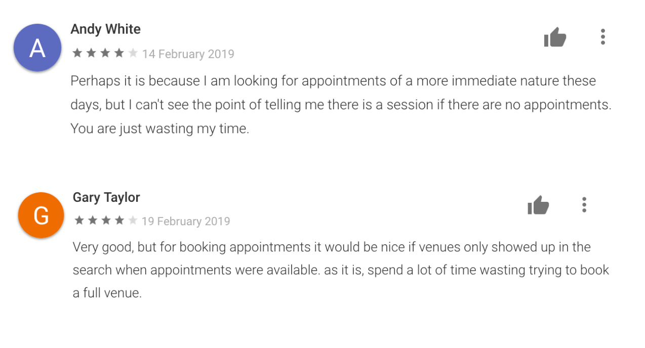
- Filtering results needed to be easier / it was hard to spot how to apply filters
- Health and travel information was duplicated in different places in the app
- The menus were confusing to navigate
- The back button didn’t work properly when booking an appointment (i.e. the state wasn’t being saved when searching and booking an appointment)
- Some copy can be made clearer e.g. hard to know what “donation credits” meant
- There was an overwhelming amount of info on the health results page (half of my participants failed the task to determine if they were eligible to donate having visited Malaysia, solely because they skim-read the block of text on Malaysia)
One of the main takeaways from these results is about navigation. It’s hard to get around the app as it currently is, because there are hidden menus, there are multiple ways to navigate to the same place, and the back button is unpredictable. Moreover, there’s no clear reminder of where you are in the app.
So one of the main things I add in my new prototype is a persistent bottom navigation.
6. New protoype and more usability tests
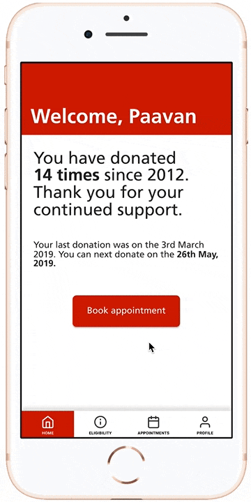
The navigation in this prototype is always on screen, and you can jump to every section from wherever you are.
Instead of the current app’s slide-in-from-top hamburger menu with 8 items, I chose to only have four sections.
All health and travel info is covered in the eligibility section, and nowhere else. Booking appointments and seeing previous appointments is all done in the appointments section. Viewing and changing profile is done in the profile section.
Each new redesign should go through the same usability tests. My re-tests were limited as I only designed the screens you can see here, but the participants did complete the same tasks faster and more successfully using the new design.
7. Future steps & lessons learnt
Future work could be about combining the location and datepicker. Having to go back and forth between a location and a a suitable day and time is frustrating.
In the above gif, you can see that I started the appointment booking flow by asking users to choose how they want to book an appointment, either by date and time or by a convenient location. But I think that even this simple choice gives the user too much responsibility. I’m sure there’s a way to combine these options into a single slick booking flow.
A good thing about the current app which I didn’t mention above is it’s similarity to the web version. (I think the booking part of the current app may just be a scaled down and embedded web view displaying that portion of the website.) This is good. There should be a consistency between them, as after all, they are doing the same thing, regardless if its a website or an app. A full redesign should account for this, and make sure to update both the website and the app together.
One way would be to make a single responsive design that works at any screen size and scales appropriately. (Some high-fidelity prototyping tools, like Framer, XD and InVision, are moving towards including this).
I learnt a huge amount while doing this project. Lots was in terms of the UX process, as I describe above, but I also learnt lots of UI best practices when designing the prototype in Figma. (I didn’t touch on that in this article, but a lot came from Refactoring UI, which you should definitely check out if you’re interested in UI design.)
Thanks for reading!
(PS: If you don’t give blood and are able to, it’s (a) really quick, (b) it’s a good thing to do, and, (c) weirdly, it’s kind of fun. Check out blood.co.uk if you are in England, and the equivalent service if you’re in different parts of the UK or other countries!)