Presenting back UX findings so that people actually care
Share:
You’ve done the work. You’ve recruited users. You’ve sent out surveys. You’ve facilitated diary studies. You made the screens, you’ve made them into a clickable prototype. You’ve run usability tests. You’ve collated all your findings.
But now what?
You’ve got a set of insights and a list of suggested changes.
But how do you present that to your stakeholder or sponsor, so that they’ll actually care?
How do you make sure they view your findings, trust the work you’ve done, and engage with them, giving you any feedback you need?
Consider the overall shape of your findings
Storytelling is intrinsic to how humans think. Great designers consider how to frame everything as a story, whether it’s a user flow journey or a prototype or a physical sign — or, indeed, a deck of UX insights and findings.
By shaping your results as a story you’ll get the most impact. Your stakeholders will empathise and relate to what you’re writing far better, and then your feedback and changes will stay in their heads for longer.
There’s a lot of storytelling theory out there. Mostly it all boils down to: archetypes are good; our brain finds it easier to subconsciously link them to other narratives we’ve seen, and hence to latch onto them. There’s a set of seven basic plots that regularly gets referenced, and of these, the story of rebirth is the one that’s most appropriate here.
(Check out Into The Woods by John Yorke if you’re interested in more detail on the types of narrative structure)
The story of rebirth is: we were this, and we’re being reborn as this.
You may think this won’t work in a presentation deck of UX findings. But it does. Remember Steve Jobs, on stage, captivating his audience with a story (and presentation) of Apple’s comeback? The power comes from him shaping Apple’s products and services, and its role as a tech company, as a story of rebirth.
We were this, and now we’re being reborn as this.
Consider how this translates onto the product or service you’re working on, and keep it in mind at every stage of your presentation.
Break it down into manageable chunks
The first rule for all UXers is know thy user. So let’s think: who’s the ‘user’ of your UX findings and insights presentation? I’m guessing it’s one of the stakeholders or product owners for the product or service that you’re evaluating. Chances are they’re someone relatively senior at your company (or your client’s company, if you’re an agency worker or contractor). And therefore, chances are, they’re quite busy.
So in order to serve them best, your findings should be presented in an easy-to-read, easy-to-digest format.
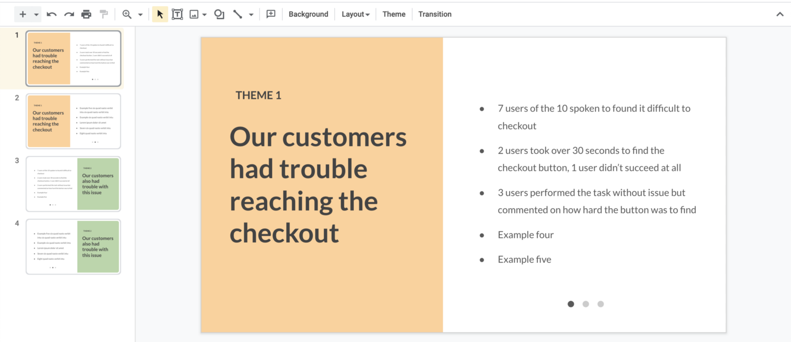
By chunking your findings into themes, it allows someone to quickly grasp the high-level points. Under each main theme, you can provide examples, with qualitative and quantitative data from your research study.
Here’s an example of a slide from a feedback deck where feedback is grouped by themes. Note how each theme is colour coded; you can use these colours throughout your presentation.
Rank themes by severity and frequency
Ordering themes by priority (and making it clear in the intro that that’s what you’re doing) is worthwhile, as it allows stakeholders to see what needs to be worked on as a matter of priority.
Moreover, if you’re presenting findings from a usability study specifically, you should rank by two factors: severity and frequency.
- High severity issues prevent a user from completing the task at all.
- Low severity issues are minor problems that don’t prevent a user from completing a task
- High frequency issues occur when 30% or more participants experience the problem
- Low frequency issues occur when 10% or fewer of participants experience the problem
It’s important to make sure you rank by both severity and frequency, to ensure you’re not just chasing a fluke. And it’s also important to test enough users: if you don’t know how many you need, the answer is probably 5 (for a usability study) according to the Nielsen Norman Group.
Of course, this ranking can be used for any type of research, but the combination of severity and frequency makes the most sense when presenting findings from usability tests.
And remember:
- Don’t undermine qualitative findings; it’s just as important to feedback insights you collected.
- Adding in pull quotes of what people actually said helps your research feel more real, and reminds stakeholders of the actual activities you’ve undertaken. You can also use a short video clip of an interview or usability session, if you’ve got consent from your participants to do so.
- Be respectful of people’s time. It may be better to send over a deck or a Loom recording for someone to asynchronously review, rather than schedule in a meeting where you just talk through that deck.
- You’ll only ever manage to do ‘just enough research’ — and that’s okay.
Further reading
Here are some further resources if you’re interested:
- Erika Hall’s amazing book Just Enough Research is incredible, and covers everything you need to know about doing research in the real world (where often there’s no time nor money for it!)
- This FigJam file of research and learning cards is useful for keeping your team aware of the work you’re doing and keeping everyone engaged
- My article on design research for startups is a great intro for how to get started with research, specifically when working with bootstrapped early-stage startups that may have lots of uncertainty (and not much money!)
I’ve read a lot about user research methods, validating assumptions, and designing great, usable products. But I’m still learning more. If there’s anything I missed, please let me know.