My problem with variables in Figma
Share:
Figma's annual conference, Config 2023, happened last week. Config featured so many insightful talks from designers and developers who use Figma in their workplaces, who shared how they get incredible work done.
But it also featured a ton of new features that were released in the tool itself, and were, of course, available instantly after refreshing your browser. One of these big new features, perhaps the biggest, was variables:
Figma was widely rumoured to be releasing design tokens, but instead released this 'variables' feature.
What are variables?
Variables are exactly what they sound like they are, if you’re used to using variables in code. They are just raw values (either colour, number, text or boolean) that can be manipulated in a bunch of ways.
And this is good! There's so much that you can do with them.
Variables are less opinionated than design tokens. You can make primitive, semantic and aliased design tokens, exactly how people were doing using third party plugins.
That way, #fefefe can map to neutral-100 and also map to #button-secondary-background or #surface-z-hover-4 or whatever you need, making sure all your designs stay consistent.
The same is true with number variables: you could have a spacing scale (1,2,4,8,16,20,24) but then also alias it to be gap-sm, gap-md, gap-l, gap-xl.
And because variables, modes and collections are all built into Figma's UI, you can do really awesome stuff, like instantly change an entire frame (or even an entire page) to a different theme or different density.
If you’re on the enterprise plan, you can consume and interact with variables using a REST API, meaning that they don't have to live inside your Figma file, and can be stored in a git repo somewhere. That way, if a developer pushes an update, it will automagically appear throughout all your design files.
You can also use variables when prototyping. And this is where I have an issue…
My problem with variables
First, let's take a quick look at setting up an advanced prototype using variables.
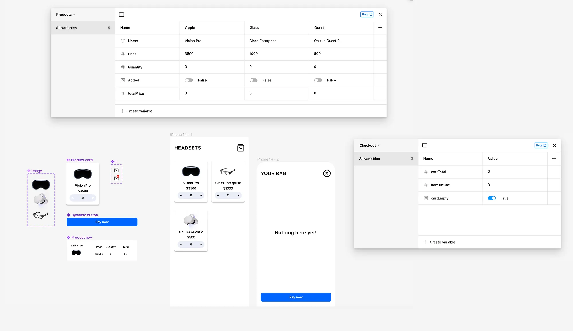
This is all of the 'stuff' that you need to set up to make it work:
- Two frames, connected with a prototype link
- A small set of components: product card and row, checkout button, basket icon with variants, image variants (because image variables are not yet supported)
- Two collections of variables

The variable tables are the thing that's new here. Take a look at them — ully you can see what each one is used for.
The Products table contains all necessary information about our products, including name, price, quantity, and whether they've been added to the cart. The Checkout table contains information about our cart.
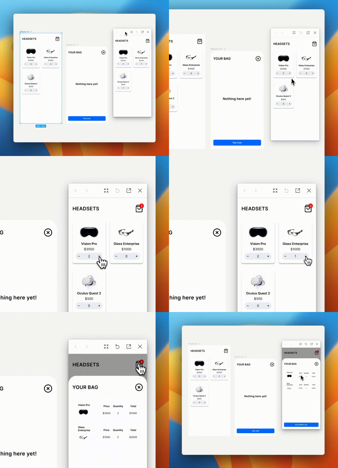
With this, we can make a completely realistic prototype that acts as we'd expect. There's an empty state for the bag, items get added and the totals for each update correctly, there's a badge indicator on the bag icon which updates correctly. (You can try the prototype out for yourself here)

To do something like this in Figma two weeks ago would have required a huge complex mess of noodled-together frames with every possible state mapped out.
But now, we just have to add a few 'set variable' and 'conditional' prototype actions, and bam, we have a realistic prototype with an infinite number of states.

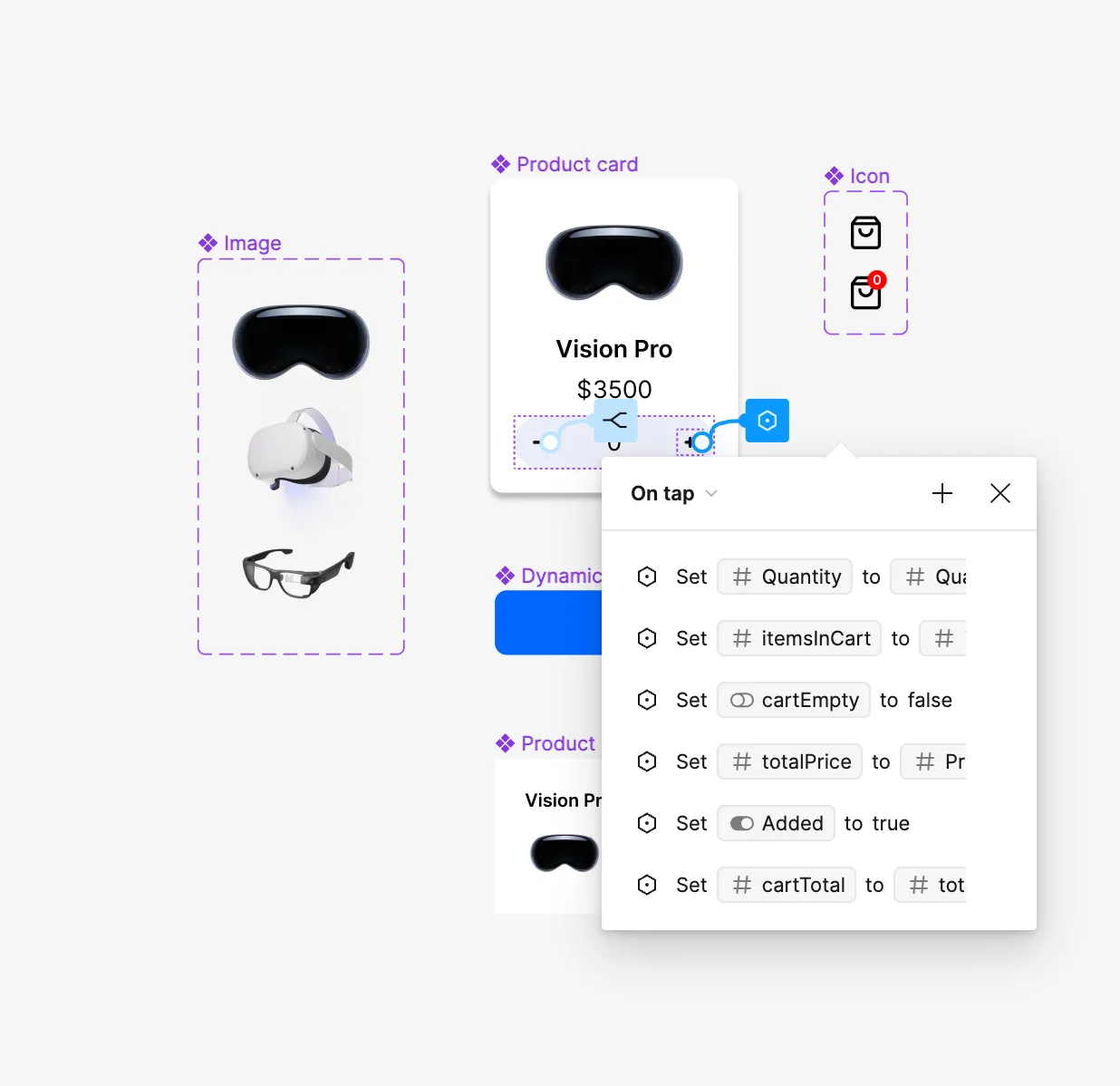
But here's the bit I don't like. It’s all so opaque. Even if you look at the table of variables, it’s hard to see how it’s all working. In the above prototype, as well as setting variable interactions on the add and minus buttons on the 'product card' component, I also created variable links to layer visibility, to enable:
-
showing and hiding the cart empty state
-
showing and hiding the rows of items in the cart
-
switching between the two cart icon variants, one with a badge and one without
-
showing and hiding the total cost in the final 'buy now' button
All of these links are hard to find. This is what I mean about it being opaque. If there are issues with the prototype, it'll be even harder to diagnose, as there's so much 'hidden work' going on, not shown as blue noodles on the canvas.
Moreover, other designers entering your file will really struggle to see how you've set things up — ally because using variables means there's more than one way to do something, just like in code.
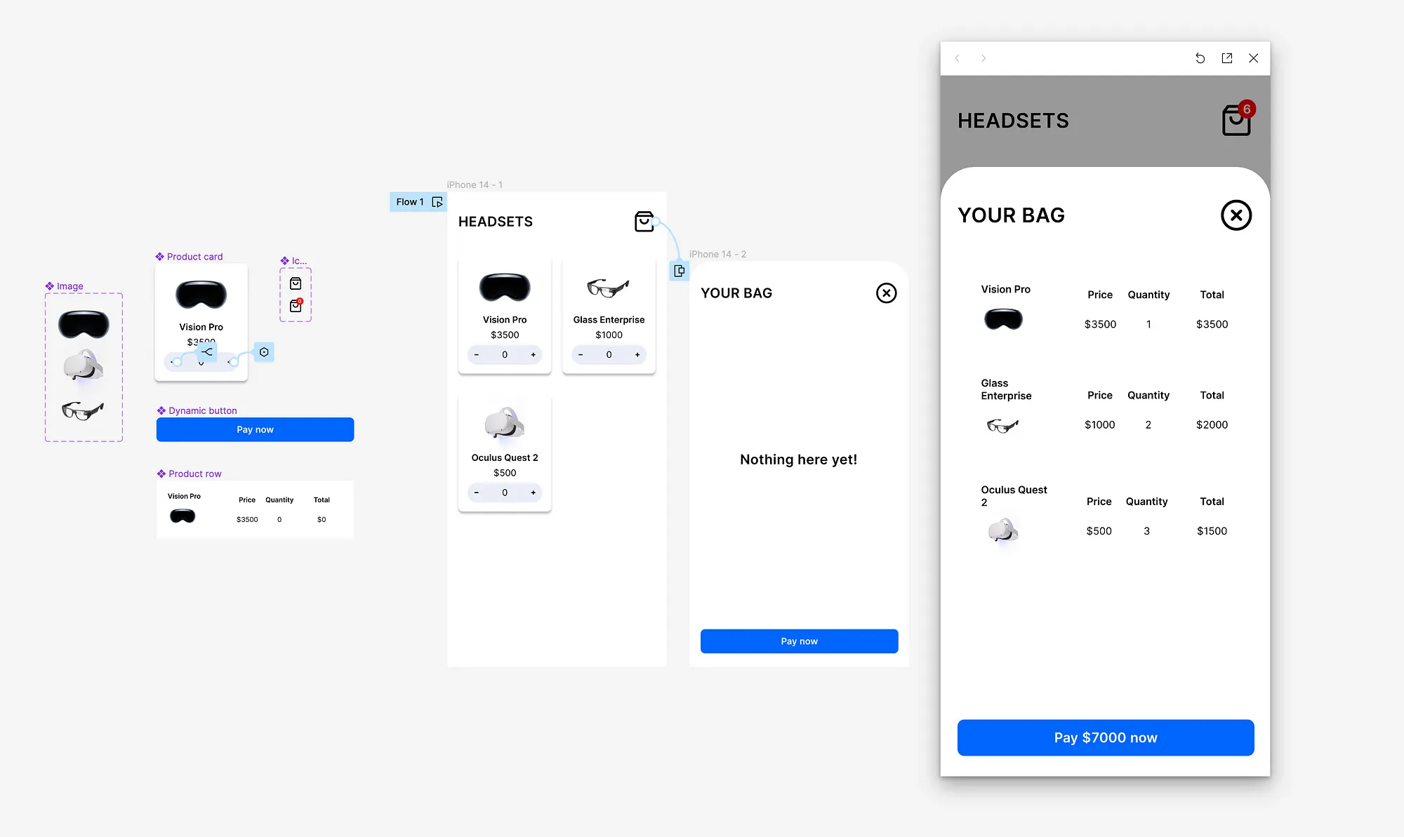
And take a look at this screenshot again:

Imagine handing over this file to a developer. Nowhere on the canvas does the prototyped state (shown on the right) appear.
You'd have to rely on your devloper opening up prototype mode and clicking around for long enough to discover everything that's been set up.
And worse, when you’re viewing designs in prototype mode, you can't see any measurements or values (nor make use of any of the awesome dev mode features that were just released).
The main takeaway
Look, I'm not saying don't use variables. I think variables are great — ally for design system management. It’s something that's been desperately needed for a while, and its great to see appearing natively in Figma without the need for additional plugins. (I still love you, Tokens Studio.)
I'm also not saying don't use variables for advanced prototyping. I think making prototypes like the above example is awesome! It definitely — when you know how to do it — will save loads of time. Moreover, it will allow for really high-fidelity and realistic usability testing, which in turn will lead to better products being made. I'm all for that.
I'm just saying — aybe don't use it all the time. Maybe split out your advanced prototypes into a new file. Maybe still create the main / most popular versions of each screens for your devs to use. Maybe don't expect that every other designer on your team will rush to build prototypes like this. Understand it will take time for everyone to get used to these new tools and these new layers of complexity.
Change takes time (but time is all it takes!)