Using voice principles and a tone map to write consistently
Share:
UX writing is a discipline that looks at all the text in your user interface. It’s closely linked to content design and content strategy —but here I use the term 'UX writing' to specifically describe all the writing that happens when designing user interfaces for digital products.
(In contrast, content design, as defined by Sarah Richards, focuses on what content best serves a user's needs, and content strategy, defined by Ben Estes, looks at a long-term strategy that uses content to achieve a particular strategic vision.)
Writing clearly and consistently is an essential part of user experience design. The goal of UX writing is to support real people who are undergoing a given user journey.
Many things can impact how your writing comes across, such as:
- word choice (are the words formal? are they casual?)
- word length (are we using long words or short words?)
- phrase length (are we using compound sentences?)
- use of parts of speech (should we use lots of adjectives, adverbs, prepositions, pronouns?)
- grammar and syntax (what conventions are we sticking to?)
…and, if you’re not consistent with these decisions, it will lead to a harder-to-use digital product.
In this series of articles, I'm planning to explore tools and techniques for good UX writing. In this article, we'll look at writing voice principles and using a tone map.
What are voice and tone?
Voice and tone are two words that get used interchangeably. Understanding the difference is vital to good UX writing.
Voice refers to the mood or attitude that gets communicated across an experience. It’s part of the brand's personality, and is therefore something that should be considered in light of the overall brand strategy. As pointed out by Chris Do and the team at The Futur, your brand is not your logo, product, or marketing assets. Instead, it is the gut feeling a person has about your product or organisation.
Think about these examples: how do you feel about Innocent Smoothies? How do you feel about Nike? When considering brand voice, you might say that Innocent Smoothies has a cheeky brand voice, or Nike has an inspiring voice.
- The voice represents the company or brand, and so should remain consistent across a given digital product experience.
- The tone also conveys mood, but in contrast to the voice, tone is something that is contextual and varies depending on what you’re writing.
The tone of your writing communicates mood and emotion, so it’s important to consider what mood and emotion you’re trying to convey. Some parts of the product experience may call for demanding and terse writing, whereas other parts may call for casual and friendly writing.
Crafting voice principles
A good way to keep your voice consistent is to set out voice principles from the offset. These should be kept somewhere highly visible to all members of the team (including devs, marketing, legal, etc) as its something that plays a part in all products, user journeys, and experiences. Get your team familiar with these principles early so they can understand the brand's 'personality.'
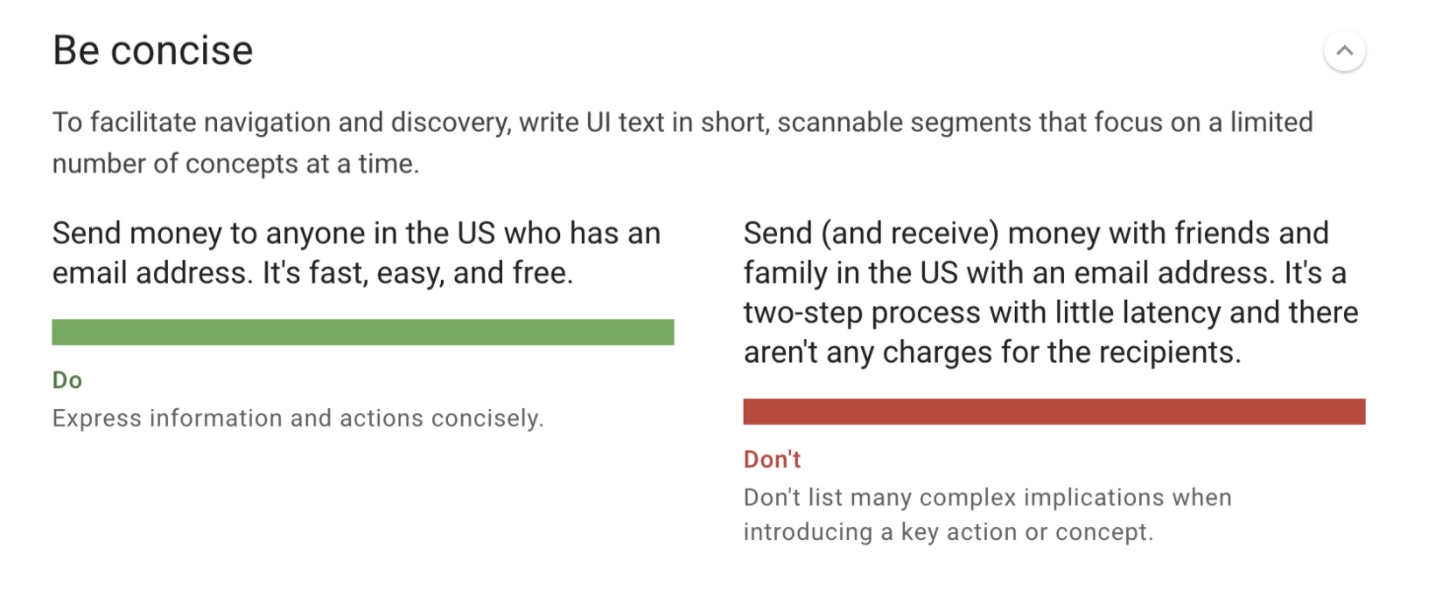
Here is an example of a voice principle, which comes from Google's Material Design communication guidelines, is to Be concise. (More examples of voice principles can be found on their site.)

If you’re struggling to come up with a good set of principles, it’s worth facilitating a brand alignment exercise with your team. In short: get everyone in a room, spend time ideating adjectives, then narrow down to choose the perfect one.

Using a tone map
A good way to know what tone to use is to start by creating a tone map. Like voice principles, this is an artefact that helps you plan your strategy in advance so that you’re not coming up with how you sound on the fly.
Start by considering the key points in your user's journey. If you have a journey map, use the different stages written out in that..
(And, if you don't have a journey map written out for your main user journeys, go create one! Creating a map forces you to align on a model, and the resulting artefact can be shared across different business functions.)
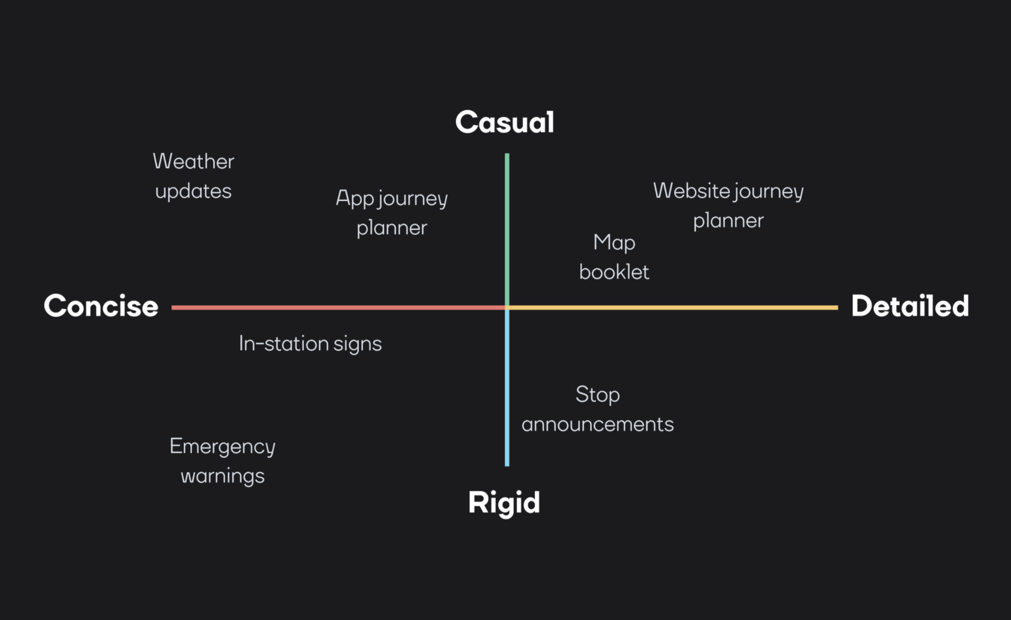
Next, choose two dimensions that can represent your range. Draw a grid with two intersecting lines and identify each axis with a dimension of tone you want to strategise. In the example at the top of this article, the two axes used are Fun ↔ Serious and Concise ↔ Detailed, but you may have a set of axes that are more suitable to your product.
All of the options for tone should match with your desired voice. For example, if our brand has an inspirational voice, it still makes sense for any copy to be fun, or serious, or concise, or detailed.
Finally, plot each stage of the user journey onto the map. Take into consideration: how much screen space will those words have? Is it vital to have complete comprehension of the message? Is there a destructive action at stake? How do you want a user to feel at this point in the journey? (Again, referring back to a journey or empathy map is useful here.)
In conclusion
Just how you may use a grid when designing an interface to help you to keep consistent spacing, having UX writing principles help you stay consistent in your messaging.
Voice principles and a tone map are the best ways to be proactive and conscious of your decisions regarding messaging.
Remember, you can always go back and change these artefacts in the future, but having something down on paper keeps everyone on the same page, and means you can make yourself redundant.
If you’re interested in exploring this further, I recommend watching this workshop by Alex Hays on UX writing from Google I/O 2021, where she covers Material's communication principles and more.