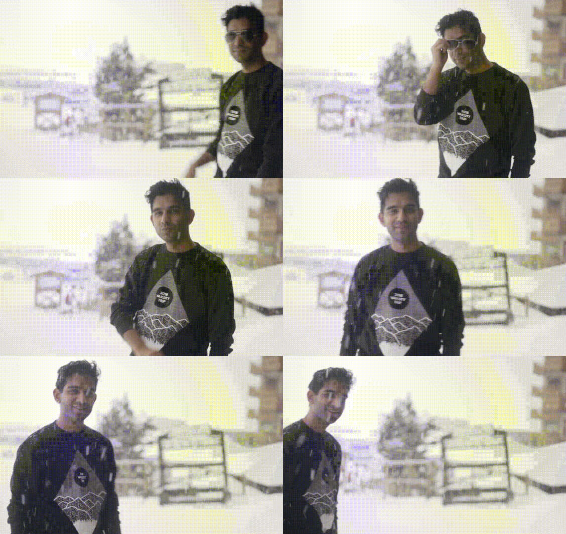
Rebranding the world’s biggest ski trip
Share:
Around this time last year I was asked to be on the committee for an event called Varsity Trip 2018, as the Design Director. In the following post I explain what I did over the course of year, between February and December 2018.
What is Varsity Trip?
Varsity Trip is the world’s largest student snowsports trip. Students from Oxford and Cambridge go skiing or snowboarding for the week after the first term of the year ends. The first trip was in 1922, meaning that the trip is older than the Winter Olympics, and is rapidly approaching its hundredth anniversary.
In recent years, the trip has been so big that only two ski resorts (Tignes and Val Thorens) fulfil the requirements of: (i) having enough space to fit everyone, (ii) having enough snow in the first week of December to ski, and (iii) being close enough to the UK to get to affordably.
The 2018 trip had over 3000 participants, and the organising committee dealt with something something figure revenue turnover. In tandem with our 9 person student committee, a snowsports company called NUCO handled logistics to do with lessons, accommodation and transport.
Branding
Because the trip is so big, every student in Oxford and Cambridge already knows about it. This means that the trip undergoes a rebrand every year — it keeps the name Varsity Trip, but gets a new logo and style of design.
The previous years’ brands had used a variety of style. You can see these below:

We designed a new logo that kept the motif of having three mountain peaks, and picked a new two-colour palette of a navy blue and burnt orange that made the logo feel much brighter. Feedback from previous years were that the logo hadn’t been versatile enough (it gets used in a huge range of printed material, online content and videos and apparel) so I designed multiple versions that could be used flexibly by the whole committee as necessary.
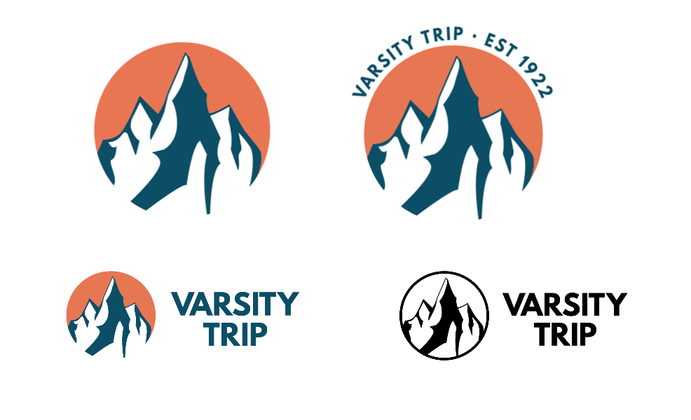
I also created an animated version, making use of the excellent animated typeface League Spartan Animated from Animography.net. This was used in video marketing, the pre and post trip videos, and the VT short film.

In the last ten years, previous committees have used a variety of fonts. These included fonts that had been commissioned (e.g. Bebas VT and Times New Snowman) as well as other free fonts. The 2017 trip used a condensed bold version of Tw Cen MT for headings. I chose to replace this with League Spartan, as it has better kerning, a wider range of letter support, and an animated version. For the body font we used Google’s open-source slab serif, Roboto Slab.
Our team also opted for a cleaner approach than previous years, primarily making use of a bright orange to complement the navy blue . We made extensive use of bold, sans-serif fonts, flat vector illustration and bright colours, to move the brand away from the murkier green and blue colours and the texture-heavy sketchy style of previous years.
Apparel
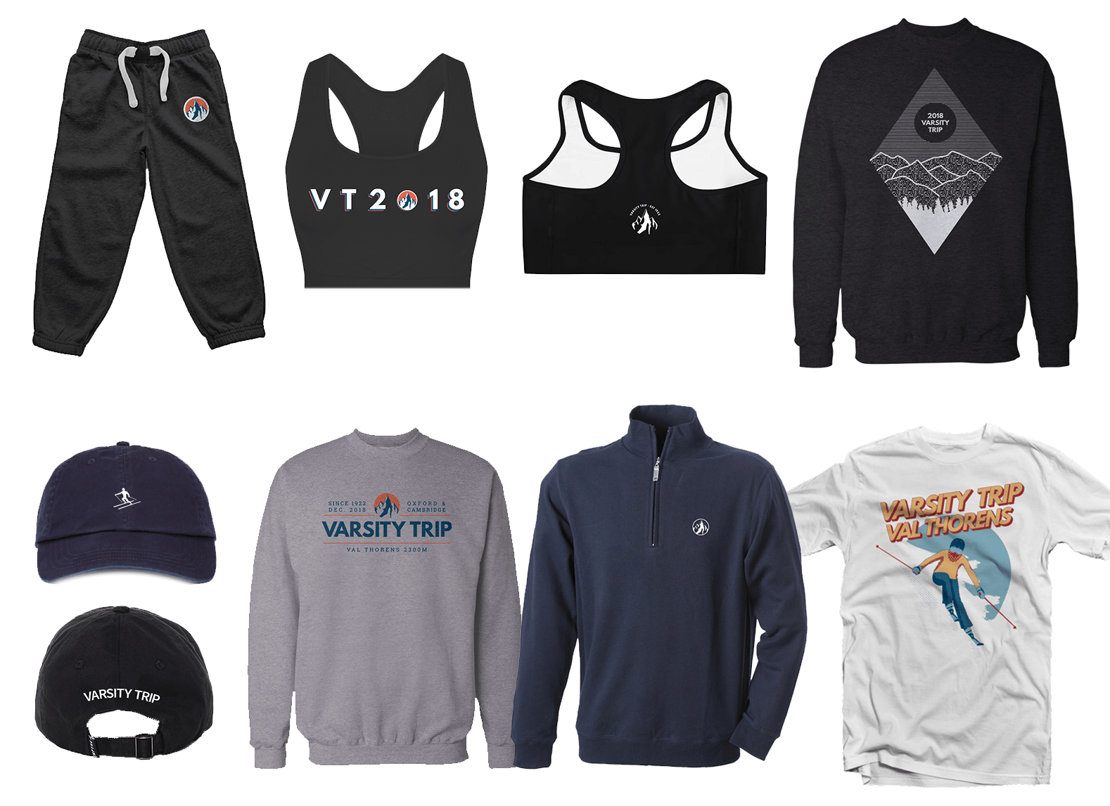
I was incredibly excited (as every designer surely is) to design things that would become physical, tangible products. There was a lot of this on Varsity Trip. Some of the apparel and merch that I designed includes:
- T-shirts
- Sweatshirts
- Beanies
- Tracksuit bottoms
- Jacquard-knit jumpers
- Ski socks
- Caps
- Neck-warmers
- Sports bras
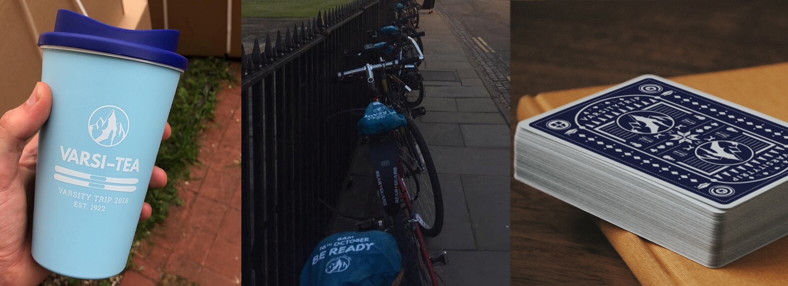
- Reusable coffee cups
- Bike seat covers
- Foam fingers
- Racers’ medals
- Playing cards
Some of these items were for promotional giveaways, but many were for sale to students going on the trip (‘stash’). We decided on which items to sell based on what was popular in previous trips (derived from sales numbers) and the profit margins of the raws items themselves. We also experimented with new items: fleeces, ski socks, and Christmas jumpers.
Stash sale numbers were incredible: we sold over 700 sweatshirts and over 400 caps and beanies.
Because so many people wear stash, it needed to be on-brand, but also subtle and tasteful, but also not bland. I purposely designed things that were minimal and kept .
To produce everything, we worked closely with:
- an outdoor clothing company (Silverstick)
- the production company that helped deliver the trip’s festival-scale club nights (Zero Degrees Events)
- the ski trip fulfilment company (NUCO)
- the resort’s tourist office (Club Val Thorens)
Here are some of the mockups of stash:
And some of the model shots:
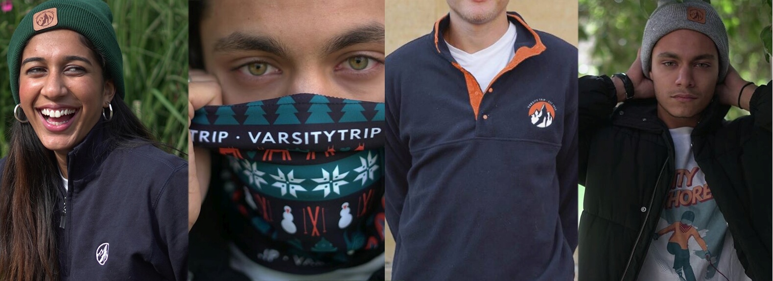
And some of the merch produced:
Illustration
Across the project, I created a set of vector illustrations. Each could be split into components and re-used across a wide range of media.
Lots of these were used for online social media posts; examples of these are below:
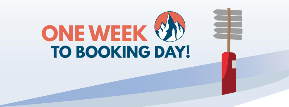
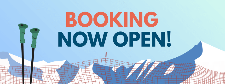
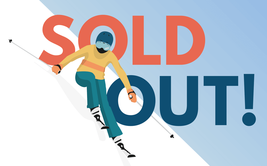
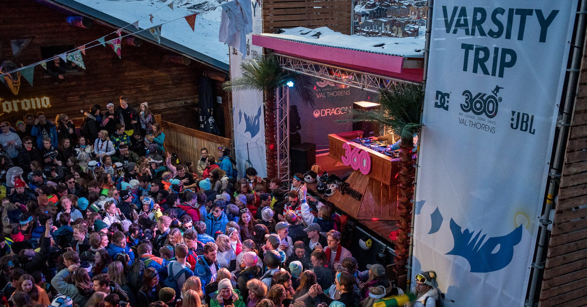
These illustrations were also used in some of the physical items I designed, such as in welcome booklets, sound-stage banners and accommodation signs in resort.
Learnings
The sheer quantity of designed elements that needed to feel cohesive meant that I very quickly learnt to design efficiently and re-use elements where possible.
All the illustrations I designed could be split into layers, allowing them to be reused throughout in different combinations, so as to always feel original. I also created templates in Photoshop so other members of the committee could make announcement posts on Facebook that still felt on-brand, and meant that I didn’t have to do it all.
Designing for Varsity Trip was a lot of work, but it was also a huge honour.
Rocking up to the Alps in December to see 15ft banners with my illustrations, covering the speakers of a huge outdoor stage, and then a day later have over 3000 students arrive wearing t-shirts I’d designed, was pretty magical.
