Testing your startup idea
Share:
In a startup, everything you do is in service of trying to validate your product-market fit. This is why startup founders obsess over working in a lean way: working with an MVP (or a set of MVPs), creating app screens and prototypes in low-fidelity, and telling everyone about our idea, waiting to see what they say.
Part of being lean is testing everything. Every decision you make is an unvalidated assumption. Each of those assumptions requires validation. How do you validate? You come up with the best solution (a 'hypothesis') and test its efficacy. You gain the most by starting with the hypotheses based around your riskiest assumptions.
This all sounds quite abstract, but it really is simple. You don't need charts and spreadsheets and a formal testing plan (though that can be helpful). This is because testing can be anything.
An example: talking to people about your idea, even in a casual setting, is a type of testing. If you talk to 4 people who are male, over 60 and generally hate using their smartphones, and 4 people who are female, under 30, and generally love using their smartphones and tell all of them about your idea, the feedback you get for each demographic teaches you something useful about your target audience.
Before those conversations, your hypothesis may have been that your ideal set of customers has properties x, y and z. Some quick conversations later might lead you to amend that hypothesis, and proposing that your ideal customer is w, x and z.
This doesn't just apply to refining your target audience. You can form hypotheses about anything: product-market fit, pricing strategy, product usability, content suitability.
Setting these hypotheses and continually narrowing down your solutions means that you never get stuck in one direction without having first proven it’s the right direction.
Here's a look at three of the ways we've tested our proposition.
1. Concept Testing

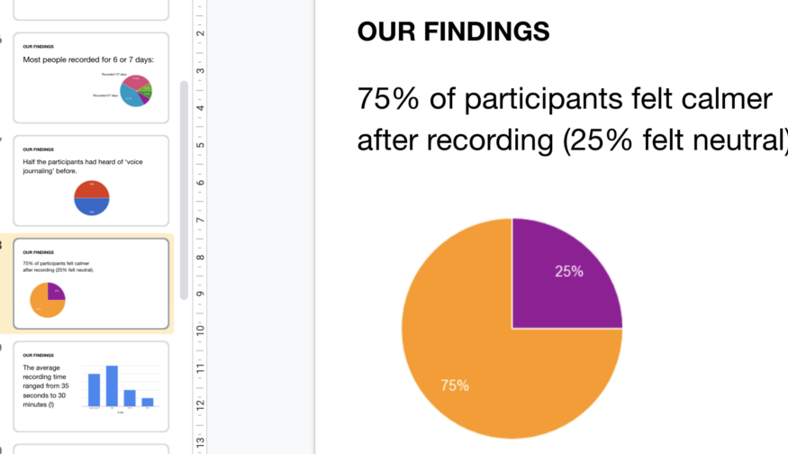
One of our key findings: 75% of participants felt calmer after sounding off.
Early on in the creation of the concept of sounding off, we knew that we had a novel idea, and we knew that the science-backed us. But we weren't sure if people would truly understand the benefits of it, and find it to be a valuable exercise.
Our hypothesis: people will want to record themselves sounding off every day.
We tested this hypothesis by asking friends to make voice recordings about their day, each day for a week. Afterwards, we sent them a survey to fill out about the experience.
As we hoped, 75% of people felt calmer after doing so, and 100% saw the benefit of it and knew someone they would recommend it to. We learnt tons about the experience of sounding off, such as where people were most likely to do it, what time of day, what they talked about (in general) - and who our ideal users likely were.
We ran this test without building anything. People could just use their voice memos app on their phones like Rory did when he first started sounding off. This was the leanest version of our app imaginable, with no extra features, no design, no branding - not even a name. It’s what we call a concierge MVP. It allowed us to test the product without building anything.
2. Pilot Week

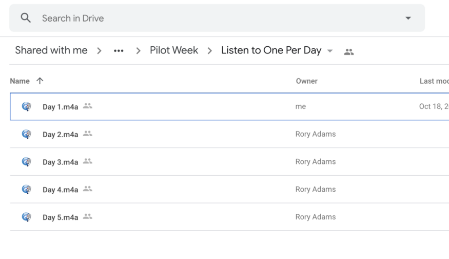
We used Google Drive for this MVP, adding files each day so test participants couldn't skip ahead.
A core part of our idea was that the app would feature audio content, to guide someone who was new to sounding off and help them get the most out of it. We knew roughly what we wanted this to be, so we had a hypothesis in place.
Rory and Elly then wrote, recorded and produced a week of audio content. We had a handful of testers who sounded off for a week while following that daily audio guide. Based on that, we were able to finalise the format, and feel confident with questions about music, length, delivery times and so on.
This test really focussed on the format; the actual content was used as a placeholder. The content itself is going to be written, recorded and refined, with the aim of having the first Foundations series finished by the end of 2020.
3. Usability Testing

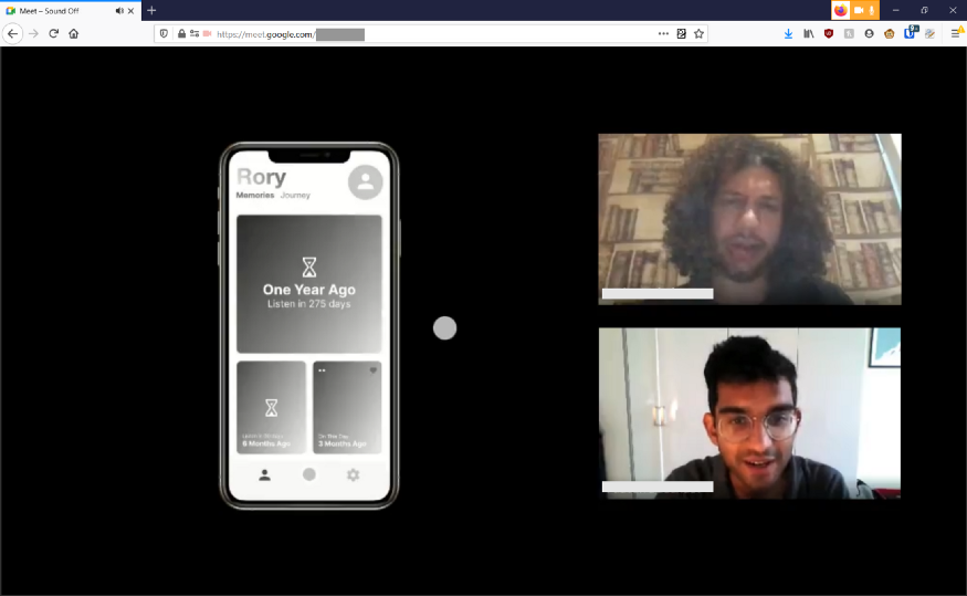
Using Figma's in-browser prototyping we conducted remote tests over webcam, which was as simple as jumping on a video call and having our participant share their screen.
We ran extensive usability tests early on, back when we didn't even have a logo or any idea of what the app would eventually look like.
Usability testing is the process of, well, testing how usable your app is. you’re not testing how good a user is at making it through the app; you’re testing how good the app is at being easily usable. You start with a hypothesis, say, that you have the best app flow for your given product. And then, through usability testing, you find places to adjust and refine that flow.
One of the most important Laws of UX is Jakob's Law, which states that:
Users spend most of their time using other apps. This means that users prefer your app to work the same way as all the other apps they already know.
Running usability tests ensure that your app has that intuitive 'don't-make-me-think'-ness, which in turn means that a user feels confident and in control when using it.
I learnt all about how to run usability tests from attending and running UX training at my previous job with AND Digital. The best online resource I've seen is Marieke McCloskey's Skillshare class, that takes you through how to run a usability study and a heuristic analysis. Check it out here.
A lot could be written about usability testing. Here are just three quick tips based on our experience of usability testing the Sound Off prototypes….
Watch how they act
When asking users to complete tasks, don't listen to what they say. Instead, watch how they act. Watch where their thumb starts to move. Watch where their eyes dart to. You'll learn a lot more about their subconscious thinking from this than from what they say.
Stay low-fidelity
I previously wrote about the benefits of working in low-fidelity. The main benefits are that you can reduce risk and increase speed. You can check out that article here.
Working in low-fidelity has a few specific benefits for usability testing. Firstly, users won't get drawn into aesthetics - although we still got a ton of comments such as "why does it all look so grey?" Secondly, there's less pressure all round. Your users are more honest, as they know its an early version of the app, and your designer is less wedded to the solution.
Don't ask leading questions
If something isn't finished, don't ask a user about what will be there. Instead, ask what they'd expect to happen. For example, if you have a sharing button that would open a share overlay (but doesn't in your prototype), see if your user taps it, and ask them what they'd want to see happen next.
Testing doesn't end when we're in active development. Going forward, we're going to be doing lost more testing: QA (quality assurance), which for us, is testing the connection of our app to our Firestore database and Flamelink CMS, and testing the app's layout and placement on a variety of devices. And down the line, multivariate (aka A/B) testing, where we test different options, such as taglines and title, to see what performs better.